Table of Contents:
- Strategy #1: How To Avoid Being 'Washed And Rinsed' When Trading?
- Strategy #2: How To Become an Expert at Reading Price Movement?
- Strategy #3: How A Professional E-Mini Trader Finds Great Trades?
- Strategy #4: Stalking Major Moves: How To See Signs of Where the Market is Headed?
- Strategy #5: How A Professional Trader Builds a Case For Entering a Trade?
- Strategy #6: How To Train Your Eyes To See Charts Like a Pro?
- Strategy #7: How I Stalk My Trades To Find Good Entries?
- Strategy #8: Using Simple Box Formations For Big Trading Profits.
- Strategy #9: Reading Gaps in Charts to Find Good Trades.
- Strategy #10: The Ultimate Risk Management Tool: Equivalent Risk.
- Strategy #11: Improving Your Skills at Predicting Market Behavior.
- Strategy #12: How To “See” The True Message of the Markets?
- Strategy #13: How To Remain Confident Even in Uncertain Markets?
- Strategy #14: Taking Quick Profits vs Letting it Run: “Bread and Butter” or “Bread Crumbs”?
How To Avoid Being 'Washed And Rinsed' When Trading?
How many times has this happened to you? You waited patiently for the market to show you where it’s going, then bought or sold the breakout to new highs or lows, only to be stopped out when price pulls back against the new trend. And of course, once you were stopped out of the market, the market returned to the trend "Without You!"
Or maybe you waited patiently for price to approach a prior area of support; then you got long at that support area. Once you were in the market, price briefly violated the support area, stopping you out of your position. And of course, once you are stopped out of the market, the market climbed back above the support and headed higher "Without You!"
You were just "Washed and Rinsed", which is a classic trading term for being stopped out of your position on a minor pullback against the trend. Let’s look at a chart showing a classic ‘wash and rinse’ pattern:
Click on the image to open the full size version!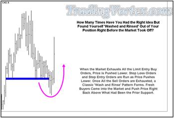
The traditional method for buying at prior support would be a limit buy order at the test of the prior multiple bottoms marked by the blue trend line and then putting a stop loss order below the trend line. You can see this method would have resulted in you entering a long position and then quickly getting stopped out as price briefly plunged through the trend line area.
When prices began to trade below the trend line marking the multiple lows, breakout traders began selling ‘at the market’ to enter new short positions. These new entry orders pushed the market lower, executing stop loss orders left by the traders that had been getting long against the support marked by the trend line. But note that once the breakout traders’ orders and the stop loss orders ran their course, price pulled right back above the trend line and headed higher "as the new short positions entered on the break below the trend line began to be stopped out!"
Getting ‘Washed and Rinsed’ is a common occurrence in trading. Is there a way you can avoid it?
I have been working with my students in one on one mentoring with a pattern we call the ‘Lazy Z’ that was designed to help avoid being ‘washed and rinsed’ when attempting to enter trades at these critical areas. Let’s look at some charts and see if I can explain how we use this ‘Lazy Z’ pattern to help avoid being ‘washed and rinsed’.
Click on the image to open the full size version!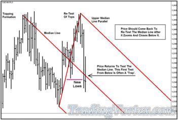
Price just ran through an area where it should have slowed or even stopped and reversed: The red down sloping Median Line. In the past, traders that use Median Lines would look to sell a re-test of this down sloping line as price pulled back to it from below.
But looking at the statistics of trading this pattern over the past three years, it has become obvious that many times, this first breakthrough and subsequent pullback is often a trap.
Let’s look at another chart and see why traders are finding themselves stopped out of their positions in this situation:
Click on the image to open the full size version!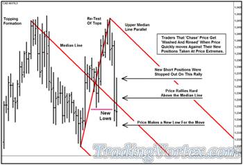
As price makes new lows for the move, it ‘zooms’ or runs through and closes below the Median Line. When price makes new lows, breakout traders establish now short positions by selling ‘at the market’ and at this point, these new positions have very little profit in them.
Once the selling has dried up, price begins to pull back and many of stop loss buy orders, left by breakout traders above where they entered their short positions, are now being filled driving the market higher. The rally after the new lows runs higher until all the stop loss orders are filled; then price settles back lower, making a marginal new low for the move.
Click on the image to open the full size version!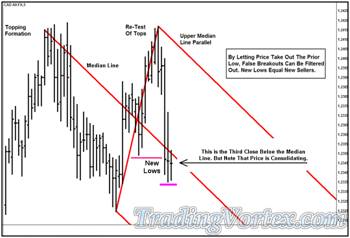
The price has now closed below the Median Line three bars in a row but it is making no progress to the downside. The traditional Median Line entry method would have been to sell a re-test of the Median Line as price re-tested it from below, but as I noted earlier, we have noticed that this entry setup has been degrading in quality over the past 18-36 months.
Also note that if you chose to sell a re-test of the Median Line as price approached it from below, there was no logical place to hide a stop behind prior swing highs.
Click on the image to open the full size version!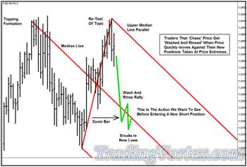
Description Of ‘Lazy Z Pattern’:
Here’s a look at the pattern we have been testing, the ‘Lazy Z’ pattern:
- Price makes a new low for the move, zooming through a Median Line or a trend line.
- Because new short positions were taken by the breakout traders, a ‘wash and rinse’ rally ensues, shaking out the ‘weak’ short positions.
- Once the new weak short positions are ‘washed’ out of the market, price goes on to make new lows for the move.
Lazy Z Pattern Quality Analysis:
- Price makes a new low for the move, breaking below a trend line or Median Line. In this move lower, breakout traders enter new short positions when price breaks below the prior low.
- A short covering rally ensues, as the new weak short positions get ‘washed’ out of the market. This rally ends as soon as all the stop loss buy orders are filled.
- The short covering rally leaves a ‘pseudo’ swing high that is above the trend line or Median Line, but near enough to the current action to be useful when attempting to hide stop loss orders.
- Fresh sell orders enter the market and push it to new lows again. This second wave of selling confirms that there are new sellers available to push prices lower, in effect, the second low confirms that the trend is likely to continue. When a new low for the move is made, it confirms the ‘pseudo’ swing high as a true swing high, and there will now be limit sell entry order at or near that new swing high that you can use to protect any short positions you initiate.
- Now you can enter a sell order at the re-test of the trend line or Median Line in case price approaches it from below. If filled, your stop loss order will be above the recently formed swing high.
Now that I have drawn it all out and described it, let’s see how the market behaves:
Click on the image to open the full size version!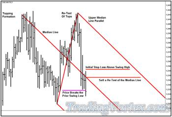
Price makes a wide range bar lower. Note that it leaves a higher high and a lower low! This bar marks a new low for the move and the high of this bar is now a ‘pseudo’ swing high.
I place orders to sell a re-test of the red down sloping Median Line. I price rallies to the Median Line from below, I want to enter a short position and my stop loss order will be above the new ‘pseudo’ swing high.
Click on the image to open the full size version!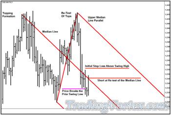
Price makes a new low for the move, confirming the ‘pseudo’ swing high as a true swing high and then rallies to test the Median Line. I get short at test of the Median Line and my stop loss order is above the new swing high, where there should be limit entry sell orders left by traders looking to enter new short positions. These orders should act as protection and help keep me from being ‘washed and rinsed’.
Price rallies a bit higher but then the selloff begins again. Note that my stop loss order was never in danger. Now I can focus on managing the potential profits in this trade as price continues to make new lows.
Click on the image to open the full size version!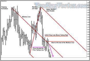
‘Lazy Z’ entry technique used on a trend line:
Click on the image to open the full size version!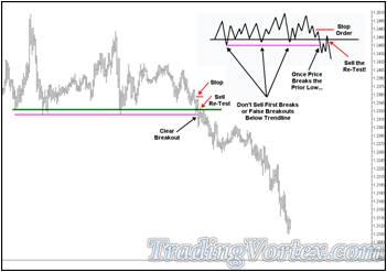
You can see that price has tested this trend line many times and each time, the trend line held and a new rally was spawned. But if you look carefully, there were at least four occasions where selling new lows led to getting ‘washed and rinsed’ out of a short position. If you had tried to sell new lows four times and gotten stopped out four times, would you have been able to sell the fifth break to new lows? Would you have been able to sell the sixth break to new lows?
Rather than sell blindly selling new lows, smarter traders have started waiting for a pullback to sell: they have learned that ‘what was resistance has become support’ and are trying to exploit it. But even this method has become susceptible to the ‘wash and rinse’ pattern.
- I suggest you don’t sell new lows or buy new highs: there are too many false breakouts and most of us are not equipped emotionally or financially to be there for the fifth or sixth or seventh breakout if we have sold and been stopped out of the prior four false breakouts.
- I also suggest you consider revising your trading entry that includes selling when price pulls back to the resistance [which had been support].
- I suggest you consider looking at the ‘Lazy Z’ pattern. Make certain there is a fresh steady stream of sellers by sitting on the sidelines until price makes a ‘wash and rinse’ rally, then makes a fresh new low, and THEN enter your limit sell order with a stop loss order above swing high just made when the weak short positions were forced to cover.
- You will have found confirmation that there are fresh sellers and now you’ll have a swing high to hide your stop loss order above, ensuring some protection from limit sell entry orders.
- The markets change and evolve. If we don’t do our homework and adapt accordingly, our trading profits will suffer and eventually disappear.
How To Become an Expert at Reading Price Movement?
Besides being a professional trader for the past 37 years, I have the privilege of mentoring some wonderful traders of varying degrees of experience. I happen to mentor a pair of gentlemen that run their own very successful CTA and besides working with them on Median Lines, I have also helped them really master the concept of using structures in the market as areas to hide your stops. They have also seen the importance of my innovation, Energy Points [or areas where lines of opposing force meet], and use this concept successfully in their trading.
Recently, we were both stalking the same market on the same time frame, the Crude Oil futures. Crude Oil futures are notoriously volatile and obviously have become more so in the past 2-3 years. There are many times when you see a bar unfold and look at it in disbelief, certain that the bar extreme range of the bar was caused by an incorrect price that will later be corrected by the exchanges; sometimes you are right and it was an incorrect price and sometimes you are wrong and it is a wild wide range price bar. But there is NO way to tell as each tick unfolds. Perhaps the exchange transmitted the wrong price, perhaps your computer got disconnected from the price server for a moment and that caused a corrupt data point or perhaps the price was real.
I recently spoke at the Forex Expo in Las Vegas and one of the reasons many of the panelists [including myself] gave as a reason they liked the data delivered from the exchanges better than the data delivered in the Cash FX market data feeds, for example, is that it is cleaner, more reliable and every single transaction is recorded and transmitted in the order it was executed; in the Cash FX market, there are at least fifteen different ‘major’ data feeds and if you look at their data, you’ll see they all have different daily highs and lows, the highs and lows of each of the bars are slightly different from feed to feed, in short, while they represent the market, they are not an accurate tick by tick picture of the market. When you compare them to the electronic contract feeds from the exchanges, the difference is night and day. But there is a dirty little secret here: in ‘real time’, even the exchanges sometimes transmit ticks that are incorrect, although they do go back and re-transmit the correct data. IF your charting package reloads historical data automatically and or allows the exchanges to refresh tick historical data, you’ll probably never notice any errors unless they are blatantly out of the current range.
The Crude Oil Trade Example:
Let’s take a look at a gorgeous trade in the crude oil that two of the gentlemen I mentor and I took in the Crude Oil futures market.
Click on the image to open the full size version!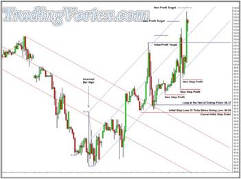
Looking at the chart above, you can see that price was in a steep down trend and then after a very wide range bar, began to make higher highs and higher lows, a sign of a change in behavior. This made all three of us start stalking a potential long set up in the Crude Oil Market, since it had fallen more than $50 per barrel from its highs.
Our eyes were drawn to several Energy Points above the market and we monitored each one, looking for a high probability trade set up with an acceptable initial stop loss to enter a long position. You can see that price got dragged to the Energy Points [a key attribute of Energy Points] and then finally at the sixth Energy Point, we saw what we were looking for: A high probability trade set up that I teach and trade all the time [in this case, a test and re-test] with an acceptable initial stop loss order area that was hidden below market structure. Hiding our stops UNDER market structure is key, because other traders will have limit buy orders near or at that market structure [in this case, a prior swing low] and their limit buy orders will act as protection for our stop loss orders.
In this trade, we wanted to get long Crude Oil futures at 96.37 with an initial stop loss at 95.63, hidden underneath a prior swing low where other traders were leaving limit buy orders. Our profit order would be at the Upper Median Line Parallel, which initially came in at 102.29. We were risking 74 cents per barrel to make a potential 5 dollars and 92 cents, giving us an initial risk reward ratio of 8:1. And as time moved price to the right on the chart, the profit target and our potential profits would go higher.
We checked our orders and put them in the market and our entries were filled on the next bar. You can see our position was never in any danger of being stopped out after the second bar closed and then we simply had to manage the stop profit and limit sell orders as price unfolded. As I say over and over, you spend the majority of your time when trading doing the tedious work: moving orders, checking details, and waiting, waiting, waiting.
Price finally met the Upper Median Line and took us out above 105 a barrel and we obviously made a great deal of money per contract on this trade.
But there’s a problem: While this trade unfolded on the charting package we were using exactly as you see on this chart, if you look carefully before price turned higher, I marked a wide range bar with the term ‘Incorrect Bar High’. In reality, the high of this bar was nowhere near as high as initially reported by the exchange. In fact, the high of this bar was actually about THREE dollars per barrel lower than it was initially reported. It’s difficult to know what caused the initial tick to be reported that high: It may have been a glitch at the exchange, it may have been a glitch at the data server farm at the firm we get our data from. But in any case, it is a phantom high, it never traded anywhere near that high! Our charting programs generally go back and correct small tick errors but this error was so far out of the range, the normal tick filtering mechanism in our charting program didn’t flag it and replace it. It stayed at that high level.
Yet we made our money using that phantom high as one of our pivots. This leads me to point out that you can’t spend your day worrying about the validity of each tick as they unfold, you have to trade what you see and trust you are seeing a representative picture of the market.
How did I find this ‘Phantom Tick’?
I regularly do a type of homework on two of my charting platforms after the market closes. They have the ability to replay price action from a number of days at thirty times the speed that price actually happens in ‘real time’ during the day, so I can practice looking for set ups in ‘sped up’ time over and over in a number of markets whenever I wish. I find this tool very valuable and I am always surprised that more traders don’t use this tool to practice after the markets close.
Several days after this trade was closed, I was doing my replay homework on a charting package that we had NOT used when making the Crude Oil trade. As price unfolded before my eyes, I began to recognize the market and paid strict attention, looking for a change in behavior. Let me show you what I saw on the ‘other’ charting package:
Click on the image to open the full size version!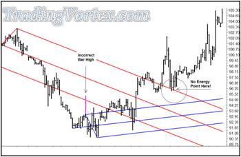
I marked the range of the ‘Phantom Bar’ in pink to make it easy for you to see. Without the incorrect extreme high that was originally reported, the slope of blue Median Line set was changed dramatically and you can see there were no Energy Points up at the area where we entered our position using this data. There may or may not have been a long entry near the lows of the move right before it began to move higher, but this chart certainly looks completely different than the one we used when making the Crude Oil futures trade.
And yet, trading what we saw in front us, using solid money management, tools that we have mastered, and a solid risk reward ratio, we made a great deal of money per contract.
Let me readjust the data on the second charting package, giving the phantom tick the same high as on the original charting package:
Click on the image to open the full size version!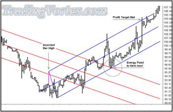
Here’s the second Charting Package With The ‘Phantom Tick’ added back in. Now you can see the Energy Points are right back where we entered and the two charts match again.
What’s the Bottom Line?
Data is not clean, it is not exact and there is no ‘Holy Grail of Data’. As a professional trader that trades billions of dollars at a time, I do the best I can with the data in front of me. I don’t spend time worrying over each tick. Instead, I trust my methodology, which has been around for nearly 100 years, my surgeon-like money management and my reliance on high risk reward ratios will allow me to make money the majority of the time, even when phantom ticks appear. I do the best with the tools I have. That’s all anyone in any profession can do.
I hope this example of data integrity has been interesting and shown you that sometimes, you can trade on something that never really happened and yet still make money if you’ve mastered your self and your tools.
Stalking Major Moves: How To See Signs of Where the Market is Headed?
I have had the privilege of making my living as a professional trader for the last 37 years. I began my career by learning to draw daily bar charts on large sheets of paper and I still update my own hand drawn charts on 27 different markets each afternoon after the market closes; I keep daily, weekly and monthly charts on each of these markets. I find this practice of updating these charts each afternoon invaluable because while updating each one, I am always on the lookout for a change in behavior in that market that will give me an early clue that a change in trend is either imminent or is in the process.
Over the past several years I have been honored to be asked to speak four or five times a year at the Traders Expos and Forex Trading Expo held around the United States. Besides teaching free and paid sessions featuring my own trading methodology and meeting thousands of traders at each of the Expos. Two of the topics that always come up are: Where are interest rates heading and where do I see the Dow going in the next six to 12 months?
At the September 2008 Forex Expo, I was asked again to predict where I saw the Dow headed for the rest of the year; for reference, the Dow was trading at roughly 11,500. I told the interviewer that I had just updated my long-term Dow chart before getting on the plane yesterday and I felt that the Dow would be below 10,000 in about a month and was headed to 6350 by year’s end. He was surprised at the severity of sell off I was predicting, but I told him the charts I keep by hand had clear signs that a sell off was imminent. Later in the week, there were rumors that Lehman Brothers and AIG might fail and indeed, Lehman Brothers and another firm failed over the weekend and the Dow did indeed accelerate to the down side.
I decided you might find it interesting to see the ‘snap shot’ charts of the Dow I work with, re-created on a computer charting package so that they have the lines, prices and formations that were on my hand drawn charts right before each Traders and Forex Expo since last November, as well as a current chart. Perhaps you will be able to see the signs I look for when stalking changes in behavior and just why my prediction of this massive sell off of the Dow has been so accurate.
The Dow Jones Daily Bar Chart ahead of the 'November’s Traders Expo' recreated on a computer charting package:
Let’s start with the Dow Jones daily bar chart that was drawn just before last November’s Traders Expo, held in Las Vegas:
Click on the image to open the full size version!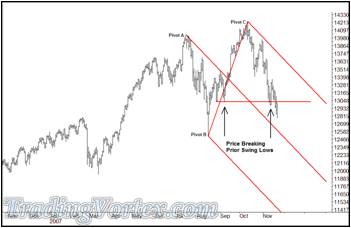
The Dow made a new high in October of 2007 but then began to sell off its highs. It made one attempt to rally and re-approach the prior high made in October but in early November, price began breaking below prior Swing Lows. It was clear that prices were not only making lower highs and lower lows, but the confirmation of breaking and closing below the prior Swing Lows [which was also a broad area of congestion] was a sign that the sellers were still in control of this market and lower prices were coming.
The Dow was just below 13,000 before my interview last November, and I told the interviewer that I felt the Dow would break the low of the last major recession, 7300, sometime in 2008. Even though there was no credit crisis yet, no bank failures, no bail out packages to lead me to my conclusion, the charts told me all I needed to know: Prices were headed lower and probably quite a bit lower.
The Dow Jones Daily Bar Chart ahead of the 'February’s Traders Expo' recreated on a computer charting package:
Let’s look at the chart that was drawn just before this past February’s Traders Expo, held in New York City and see what clues it offered about the direction of the Dow and what I said in my interview:
Click on the image to open the full size version!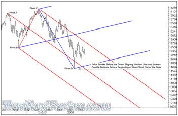
The Dow spiked lower in mid-January of this year and then began to climb higher: a change in behavior. When it began to make higher highs and higher lows, I added in an up sloping Median Line set. When speaking with the interviewer, I told him The Dow was still well below the Upper Median Line Parallel, drawn off the high at Pivot C and the new up sloping Median Line was only gently positive, so I felt that while the market would consolidate and perhaps rally a bit higher, the chart still looked bearish to me. I still felt we’d see a move to 7300 in the Dow during 2008.
The Dow Jones Daily Bar Chart ahead of the 'June’s Traders Expo' recreated on a computer charting package:
Let’s look at the chart that was drawn just before this past June’s Traders Expo, held in Los Angeles and see what clues it offered about the direction of the Dow and what I said in my interview.
Click on the image to open the full size version!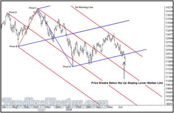
Between February and mid-May, the Dow did exactly what the prior chart had predicted: It traded gently higher, consolidating in a 1200 point range as it made higher highs and higher lows. The combination of the Dow gently rallying and bars moving to the right each day brought the price of the Dow above the red down sloping Upper Median Line Parallel. Once price closed outside the Upper Parallel, I added a red down sloping First Warning Line to the right of the Upper Parallel, because with roughly 80 percent probability, my statistics show that price will make it to that next line. Note that it worked like a charm! But once price tested the First Warning Line in mid-May, a change in behavior occurred: The Dow basically left double tops just above 13,100 and then turned lower and began making lower highs and lower lows.
More important, in early June, the Dow broke and closed below the blue gently up sloping Lower Median Line that had marked the beginning of the consolidation rally. During my interview, I reiterated that I was extremely concerned that the Dow was in serious trouble and the recent sell off was likely to accelerate. The red down sloping Median Line set was clearly in control and this new change in behavior to lower highs and lower lows, coupled with the close below the up sloping Lower Median Line led me draw in new targets on my hand charts. I now felt we might easily see a move 1000 or more points lower than the prior 7300 major low in the Dow yet this year.
The Dow Jones Daily Bar Chart ahead of the 'September’s Traders Expo' recreated on a computer charting package:
Let’s look at the chart that was drawn just before this past September’s Forex Trading Expo, held in Las Vegas and see what clues it offered about the direction of the Dow and what I said in my interview.
Click on the image to open the full size version!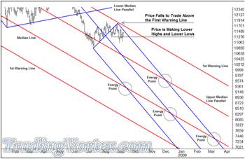
This is a closer look at the same chart so you can see more of the future potential moves that the Dow may face. The Dow sold off to the 10,850 area, breaking back below the down sloping red Upper Median Line Parallel before beginning a climb higher (another change in behavior). The Dow basically rallied about 800 points but when it approached the down sloping red First Warning Line, it ran out of up side directional energy and began a sell off with lower highs and lower lows (another change in behavior).
I know most of you want to know where the Dow is going, where this will all end and when it is time to start buying stocks again. But remember, I am in the trading business. I don’t predict the weather, I don’t predict where things will start and stop; instead, I look for signs of a change of behavior and work with Median Lines and “Median Lines are leading indicators”. This gives me an edge on the majority of other retail and professional traders, because I am already stalking the markets I trade for turns BEFORE they occur. Then I look for high probability trade entries in those markets to take advantage of the moves the charts tell me are likely to happen.
You can see I have circled a number of areas on the chart above. Those are ‘Energy Points’ or ‘areas of confluence’, where two or more tested lines cross. I am proud to say this is one of the innovate indicators I have brought to the world of trading and I teach traders how to use these areas to greatly improve their trading results in their trading in my seminars and one on one mentoring. Energy Points act as ‘price attractors’, so when I see one on my charts, I automatically draw a circle around the area.
By looking at the circled areas, you can see the various areas where price MAY be drawn to. The red down sloping Median Line set is still ‘calling the tune’ in this market, more than a year after it was drawn. It’s too early yet to know if the new blue down sloping Median Line set will work.
But to me, one thing was clear as I sat down to be interviewed in September: The Dow was about to head MUCH lower. IF price broke below the 10,827 low made in July, the fall would be swift and brutal. And the week before I left for the September Forex Trading Expo, price changed behavior and began making lower highs and lower lows. I told the interviewer that the Dow was in real trouble, the United States was in real economic trouble, and this was before Lehman and AIG failed or were bailed out. The charts were telling me all I needed to know. The Dow was going to test and likely significantly break the prior 7300 lows. And it was looking more and more like the sell off was coming soon.
The Dow Jones Daily Bar Chart ‘Updated on October’ and recreated on a computer charting package:
Let’s look at the chart I updated on October 10, 2008:
Click on the image to open the full size version!
The Dow continued its downside behavior, making lower highs and lower lows. And in the past ten trading days, the ranges have widened and the sell off has intensified. There have been more bailouts, more failures and a package put together by the United States Government and the Dow continues to the down side.
You can see by the Energy Points I circled on the current chart just where the Dow MAY go. There may be a good selling opportunity IF the Dow rallies soon around the 9600-9700 area. The down side targets that are most likely to be meaningful are at a re-test of the 7300 area if price can slow its descent and then congest a bit before falling. There’s another Energy Point at the 6300 area that is also a good candidate to be a price attractor. And obviously, there are areas below the 6300 level that the chart shows as possible targets; in short, the Dow and the United States economy are in dire trouble.
I hate to sound so negative on the United States Economy and our stock market, but we are facing high inflation. In my opinion: inflation is currently running at 17-20 percent and the recent sell off in the U.S. Bond and Note market may be reflecting that, and are on the brink of a 1930’s type depression. Our elected officials do not have a plan, in fact, only solving the inflation problem and then the passing of time will allow the Dow, as well as housing prices, to begin any significant rally, although from significantly lower levels.
Where will the Dow and housing prices be when the bottom is finally in? I am a trader, not a forecaster. I’ll look for a sign of behavior and I’ll be one of the happiest persons in the United States when I see signs that a major bottom has form: BECAUSE I have been so negative for so long. But until our leaders give the economy the medicine, the sickness will continue.
How A Professional Trader Builds a Case For Entering a Trade?
As an educator, one of the best feelings in the world comes when you view a beautiful set of charts put together by one of your long time students that brings together market structure, market context, and a simple yet high probability trade entry set up that plays out profitably once it is framed right. Carl has been in one-on-one mentoring with me for quite some time. His trading has become more and more consistently profitable, but equally important, his ability to read, understand and place current and likely market structure into a cohesive context has really taken his trading to a new level. Let's go through a set of Carl's actual charts that he marked as he began looking at this market, as this market unfolded, as he put together a cohesive trading plan, and as he executed his trading plan live.
This type of record keeping, even in a stream of consciousness form, is immensely helpful when any trader goes back to look through and judge their current thought process. I would highly recommend traders always document their trades; and of course, the more detailed the better.
Click on the image to open the full size version!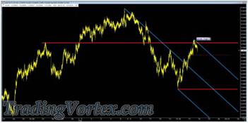
On this chart Carl is beginning to build his Market Map. The upper red horizontal line is a Multi-Pivot Line that cuts through price action, and in a sense, highlights a potential Change in Behavior. You can see that price broke below a major Swing Low, far to the left, at around eighty-nine cents in the Australian dollar but was able to recover from the spike low to retest the multi-pivot line at roughly 0.9070.
When price fails to climb and hold above the Multi-Pivot Line and begins to trade lower, Carl begins to play 'what if'? He draws in a blue down sloping Median Line, using the extreme Swing High of the move for his A pivot and the recent Major Swing Low and Swing High as his B and C Pivot. At this point, Carl is simply working on a Market Map: he's reading the Market Structure, and putting it into context. He is far away from any thoughts of a trade; he is simply drawing out the boundaries of the neighborhood, so to speak, as he becomes familiar with the territory. This is what any good map maker would do when evaluating a new territory.
Click on the image to open the full size version!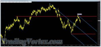
Now price breaks below the shelf featuring a minor swing low; note that Carl added a red dashed horizontal line to mark this price action. You can tell by his comments on the chart that this break of the red dashed horizontal line hasn't yet convinced him that a significant, tradable down trend has begun. He is still playing 'what if', though perhaps his Market Map is becoming a little more readable as the price action unfolds.
Click on the image to open the full size version!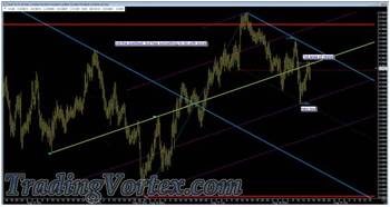
Carl zooms in on his current Market Map and adds a set of up sloping lines. He first connects a series of highs and lows with an up sloping yellow line; he then copies the slope of the line and adds a parallel up sloping line off the lowest low connected to his lower horizontal red line. He measures the distance from his lower up sloping line to the yellow up sloping line, and then projects a new up sloping line using the same slope and distance. Note that this simple technique projects forward where price will run out of upside directional energy, the high price makes as it tests the upper red Multi-Pivot line; out of curiosity, he divides the distance between each projected line and his yellow Center Line.
The notes to himself say it all: By dividing the lines into Quartiles, he sees the first dashed Inner Line catches a significant low. But before he gets too excited about one major touch, he notices the upper Inner Line or Upper Quartile, isn't showing where price is running out of upside energy.
These lines are projecting forward some frequency, but they aren't the entire story. It's just another puzzle piece he has put in place while fine tuning his Market Map.
Click on the image to open the full size version!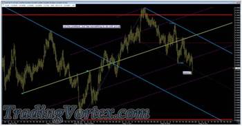
Price breaks below the prior significant low at the lower inside dashed Quartile. It is now much easier to see that price is cascading lower, leaving Lower Swing Highs and Lower Swing Lows. He marks the last bar as a probable 'Zoom' bar, meaning it ran though the lower Inside Quartile and closed near its low, a sure sign of weakness. The probable path of price is down, towards a test of the red horizontal Multi-Pivot Line.
You may note with interest that Carl has done a great deal of analysis and he hasn't marked or mentioned anything that remotely sounds or looks like a trade idea. One of the practices we teach over and over is to slow down! There have already probably been 100 potential trades if you tried to trade every squiggle since Carl began marking up this chart, but he is both trying to finish his Market Map and also looking for a high probability trade that he personally uses, and so far, while he has done a great job adding Market Structure and then defining the Context of the current market [we often say, 'The market has finally started Rolling now'], he isn't ready to trade.
Click on the image to open the full size version!
Price continues to head lower and is getting close to testing the lower red horizontal Multi-Pivot Line. It's possible there will be large Limit Buy Entry orders at the red Multi-Pivot Line, but price hasn't come down to test it and 'look behind the door' to see if there ARE Whales or large traders looking to buy at that area. And as important, the double bottoms to the left where he began the red Multi-Pivot Line would be forming his buy entry set up AND he'd either have to put his stop below them OR he'd have to use a cash or dollar amount stop. We have shown time again that stop loss orders are much more likely to remain unfilled when hidden behind Market Structure. In one on one mentoring, when a student finally begins relying fully on Market Structure to dictate where their stop and profit orders should be [because the Whales will also have orders at or near those levels], their profitability generally increases nicely, and they marvel how often their stop was missed by two or three ticks or pips.
Carl's exact comment is: 'Can't do it let's hit the layup'; that means he was considering the potential long, a 'fishing expedition' for a long position in a down trend, but the Market Map in front of him tells him if he just remains patient, a solid entry will present itself. Too many traders must trade if they are in front of their screen; if they missed entering the move down, they will 'fish for long trades' as price continues to move lower. Carl is showing wonderful discipline and patience and generally, the market rewards those that trade when they have an edge and stay out of the market when they do not have an edge; Carl is waiting to enter this.
Carl may have been correct in his earlier guess that there were Whales with large Limit Buy Entry orders at or around the red lower Multi-Pivot Line. If you look closely at the last bar on this chart, you will see that price not only tested [or looked behind the door] of the red Multi-Pivot Line, it also closed well above, which generally means there were good Limit Entry Buy orders sitting there, which caused the market to bounce as they began to be executed.
Click on the image to open the full size version!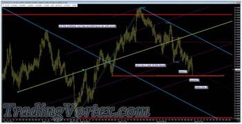
Does this mean the cascade lower is over and Carl missed his potential trade? Not at all. One bar may tell us a little, and the action after that one bar will tell us a bit more, but at the moment, Carl's Market Map is showing us a cascading downtrend and price is currently testing potential support. To put it simply, it isn't time to trade unless YOU are one of the Whales and have a reason to be buying at or near the level of the red Multi-Pivot Line.
Click on the image to open the full size version!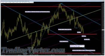
Carl watches price bounce back from the test of the red Multi-Pivot Line and notes that there probably Whales buying in that area. But again, he had no prior knowledge, in the form of a prior test of this line, to base a decision to attempt a long position. And even though price found buyers in this area, price is still cascading lower, the current market context hasn't changed.
I don't know if Carl pushed his chair back from his desk and looked at this chart from further away [something I do a lot when creating my Market Maps to keep perspective] but look what he wrote: 'this fork is HUGE' [he was referring to the blue down sloping Median Line and its Parallels]. Then he added that the 'direction may be right still but this is a 20 minute chart'. And of course, he echoed my earlier comment with. 'I bet there are multiple trades on the way down'.
What's He Saying Here?
Price has come down quite a ways and yet it is still between the Upper Parallel and the Median Line - there is LOTS of room to trade within this Median Line. Price tested its Upper Parallel but ever since, it has been an orderly cascade lower, right to the area where price may run into potential buyers.
Why Would Whales Be Buying At This Level?
This is a 20 minute chart but yet you can see that even though the immediate current trend is down [price is rolling down, we'd say], the actual earlier uptrend hasn't yet been damaged; the Whales that wanted to get long at lower prices much earlier may still have that same interest! They don't have to chase price higher; and most Whales never chase price, unless they are stopping themselves out of a losing position.
Carl has a fairly well detailed Market Map in front of him and it seems to be working just fine. He is patiently waiting 'in the weeds', reading his Market Map, waiting for an easily recognizable trade before getting involved. If more traders would exhibit this sort of patience, they would find their trading much more profitable. I'll say it again: There will always be another trade! Wait until you see an entry you recognize before getting involved, and even better, trade with the market when it is 'rolling'. Trading just to make a trade is an addiction, much like gambling; if you find yourself doing this often, you are gambling, not trading. Slow down and look for trades that make sense.
Click on the image to open the full size version!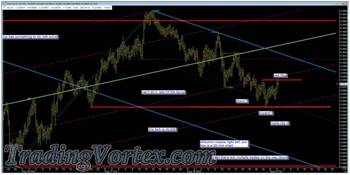
Carl's patience and his Market Map are starting to pay off. If he hurried into a short position and chased price, this bounce may have either hit his Stop Loss order or at least his 'Break Even' Stop order and taken him out of his rhythm, instead, he is looking for a trade entry he recognizes with a quality Stop Loss order that is hidden behind Market Structure and has a good Risk Reward Ratio.
He marked the first Swing High that price has been able to break back above; now he has a quandary: Is this the beginning of a new uptrend or is this the pendulum pulling back into his sell zone, in the current downtrend? How will he tell? He has already built a wonderful Market Map. He also gave you a clue about his intuition: He wasn't willing to try a long entry where Whales MIGHT be hiding their Limit Long Entry orders. Instead, he said he was 'looking for the layup', meaning he wanted to trade with the rolling market.
What About The Whale Limit Buy Orders Below?
They are now a part of his Market Map. They were there the first time price tested that area, so he will have to keep that in the back of his mind if price approaches that area again.
Click on the image to open the full size version!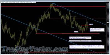
Now Carl thinks out loud: He marked the Inner Quartile between the blue down sloping Median Line and the Upper Parallel. Price could not hold below this Inner Quartile, so he is considering it the line of Maximum Excursion [remember, it has a downward slope]. Then he asks, how did we zoom above this line when we were briefly below it? Think carefully about the price action near the lows and see if you can imagine what it would take to get price to zoom out of this hole.
As price made new lows, some traders chased price lower, entering or adding short positions at lower and lower levels. And some traders tried to pick bottoms, but were stopped out-but they are still leaning toward holding long positions. When the selling hits the large Limit Buy orders from the Whales, the selling is absorbed and then dries up and both the Whales and the traders that had an interest to be long begin to buy. Soon a rally starts, and price does not have to go too far before those traders that sold 'in the hole' either to establish new short positions or to add to their existing short positions are forced to begin buying, to cover their losing positions or to protect any profit left in their short positions. As Carl said, 'How do we get a zoom? We need traders bailing out of positions!'
Carl's last comment is an important one: By the time price seems to have changed to a minor uptrend, the price action is so sloppy on both sides, he stands aside. One of the keys of Market Context is to be able to instantly assess volatility, as well as Changes in Behavior; this market has become a free for all, and right now, Carl wants no part of it.
Has His Patience Finally Paid Off?
He has the gun cocked; let's see if he is ready to pull the trigger!
Click on the image to open the full size version!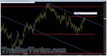
Then 'sitting in the weeds' looks like it may pay off for Carl. Price trades higher, but the price action as it retests the down sloping red Upper Parallel is 'clumping' or struggling; he also notes there is a well known Fib retracement area just above where price is stalling, and there are probably quite a few orders from traders that use Fib tools as their main indicator to sell at that level. If you put this all together and you are Carl, it spells a trade entry signal he recognizes.
Click on the image to open the full size version!
He gets short at the retest of the blue down sloping Upper Parallel after price breaks below the bottom of the clumping bars. His initial Stop Loss order is just above the multiple tops made by the clumping formation.
His Profit Target?
He'd LIKE to get his money out based on the Structure of the Market, just above prior Major lows and at the down sloping blue Median Line.
He took his time and drew a very detailed Market Map. He was extremely patient, waiting to trade until he recognized what looks to be one of his 'layup' patterns, the ones he relies on regularly. He framed out the trade in the context of the current market: This should be the pendulum pulling back to a quality sell area and if so, a Change in Behavior is occurring. Price should now begin breaking prior Swing Lows. Let's see how he manages the trade now.
Click on the image to open the full size version!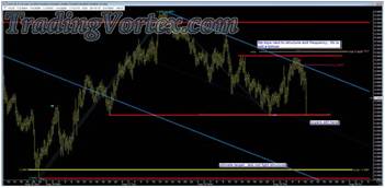
You can see that after a handful of bars, price forms a wide range bar, falling all the way to the lower Multi-Pivot Line.
Were There Buyers There This Time Down?
Look at the close, well above the retest of that horizontal line where the Whales were buying before! That's generally a sign of large Limit Buy orders. Traders opened the door, peaked in, and ran back up the hallway, closing the bar quite a bit above the area where they found the orders resting.
By the way, though it isn't marked on this chart, Carl is now working a Break Even Stop Loss. There is no closer structure he can hide behind and price is now testing key support. Should it rocket out of the hole, he has collapsed his risk so he will lose nothing on this trade.
Click on the image to open the full size version!
Now Carl notes that even though there are large orders to buy at the red horizontal Multi-Pivot Line, price is no longer backing away; the buyers are not getting much upward movement. If they don't get upward movement in the next bar or two, they have two choices:
- Pull their Limit Buy orders and let the breakout sellers get short - then buy with both hands and see if they can start a 'wash and rinse' higher and trigger the Stop Loss orders on the new short positions.
- Or if price breaks through their Limit Buy Orders, they can try to flip their position and go with the rolling market.
The next few bars are key here: the Market Context tells Carl the real battle is at hand!
Click on the image to open the full size version!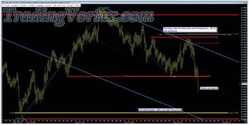
Did The Whales Pull Their Limit Buy Orders Or Did The Market Simply Roll Over Them?
It's too early to tell, but a 'wash and rinse' would be in the back of my mind. But at this point, Carl has Market Structure on his side and a great entry price, so he is hiding his Stop Profit order well above the action, where any 'wash and rinse' might take him out of his position prematurely.
Price has now zoomed the red horizontal Multi-Pivot Line, as well as the Inner Quartile, the sloped line of Maximum Excursion. Price entered into new territory.
As A Map Maker, What Do You Do? Do You Continue To Drive With No Sign Posts, No Familiar Territory?
Click on the image to open the full size version!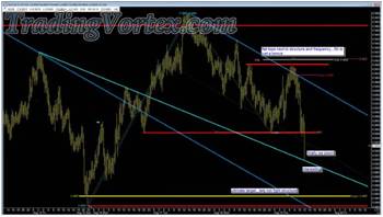
Carl realizes immediately price is in an uncharted part of his Market Map. He pushes his chair back for perspective and immediately sees a down sloping Multi-Pivot Line that catches major tops to the left and projects it forward - and notices price is testing this Multi-Pivot Line now. His profit target is well below this line and the market is rolling lower.
He has a great price on his entry and now he has both Market Structure and the current trend in his favor. He refused to chase price and instead, waited in the weeds for it to come to him, giving an entry 'close to the bone'. Now he has the luxury to manage the trade as price unfolds in front of him; the smaller normal noise of the market, the squiggles, shouldn't approach his current Stop Profit order.
As Carl says, after a near vertical move, price tends to coil, or congest. He takes the time to update his Market Map further when he sees a new down sloping Multi-Pivot Line above the current action. He is playing 'what if' as he thinks through the current price action and updates his map. He is asking himself: 'What is the probable path of price here?'
Click on the image to open the full size version!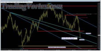
As you watch this unfold, what are you asking yourself? Would you have mapped out the market? Had the patience to wait for a quality trade [remember, I said earlier there probably 100 trades in the wavelets of this market] or would you have chased price and been stopped out several times, like most traders?
Click on the image to open the full size version!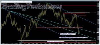
This is where patience really pays off! If you, as a trader, rushes into a position and have a poor or mediocre trade entry price, you need price to give you near immediate gratification. If you are a break out seller and got short below the red horizontal Multi-Pivot Line after it gave way, you have a poor entry price and may even be stopped out by now on this pullback, which is a natural congestion after a near vertical pullback.
Carl was patient and this is a small squiggle - it doesn't bother him at all. As he said, price is probably still going lower, but it will go down at its own pace. And since he framed this trade out beautifully and has great trade location, he has the luxury of watching while price 'plays its cards'. There is no need for him to feel any sense of urgency.
Is this how you trade or do you chase price and then pray the small pullbacks won't stop you out?
Click on the image to open the full size version!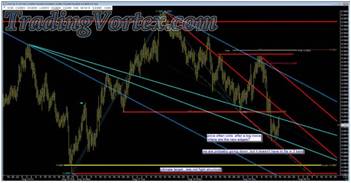
As he watches price unfold below the red horizontal Multi-Pivot Line, Carl updates his Market Map with a down sloping red Median Line and its Parallels. This red down sloping Lower Parallel has been tested already, so it is probably carrying the frequency of the current price action. Note the confluence or Energy Point where the down sloping Median Line intersects with the red horizontal Multi-Pivot Line - It may come into play.
Click on the image to open the full size version!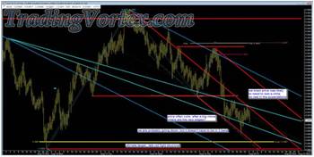
Price doesn't make it higher to test the Energy Point; instead it begins to cascade lower. And Carl's red down sloping Median Line and its Parallels seem to be doing the job. Carl's Market Map continues to do an excellent job showing the probable path of price.
Now Carl makes a very important reminder to himself: Price probably needed to rest, so relax and let it do what it needs to do. The ride lower may be slower than some traders would like, but price goes where it wants to go, at its own speed. If you have framed your trade out correctly and gotten in at a quality level, this is the time when you want to make sure you look at your Market Map several times and relax! Price has slowed down but there is no rush! Let it play its hand and don't be in a hurry to move stop profit orders too close to the action [something I see traders do far too often] or even get nervous.
You have a trading plan written down, right? Just relax and follow the plan.
Click on the image to open the full size version!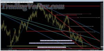
Carl gets paid well for taking the time to create an extremely accurate Market Map, for having the patience to wait to trade until he saw a high probability entry set up, then framing out a trade based on the current Market Context and Market Structure. Then he followed his plan and because of his wonderful entry level and the accuracy of his Market Map, there was never any reason to be anxious as price cascaded lower.
There is one extremely important piece of wisdom Carl casually puts on this chart: He planned to take profit just above the prior Major Low, at the yellow horizontal line. That's how he framed the original trade and when price filled his Limit Buy order, he comments, 'We got our money, take a break and see what happens next!' He needs to restore the energy and focus he expended on creating this wonderful Market Map, patiently watching and waiting for his 'layup' trade, framing it according to his Market Map and the then current Market Context and then executing his trading plan step by step.
Very few traders start out with a Market Map, many traders don't start out with a trading plan and most don't 'frame' their trade. Instead, they see the market moving and 'find' a way to get in and try to find a profitable way to exit their new position. Compare that type of trading with the choreographed ballet Carl just performed! Many of the traders that are just trying to find entries are also entering new short positions or are adding to short positions because price has just had a one bar zoom below the prior Major Low. But beware the Whales! As Carl noted: 'These moves often end with a big spike as someone pushes price to pick it up lower...'
Try and imagine what Carl is describing while I describe what happens behind the scenes, from a Whale's perspective: As price approaches a prior Major Low, price accelerates. Prior Major Swing Highs and Swing Lows are generally retested if price gets close to them, because traders want to 'look behind the door' and see if there are orders at the prior Major Swing Low or Swing High. Sometimes, Whales simply leave their orders at or in a zone surrounding the prior Major Swing High or Low. But sometimes, they actively 'trade' the area, especially if these Major Swing Highs or Lows are being tested during their time zone and they are 'wide awake', ready to play!
Click on the image to open the full size version!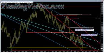
Carl's comments, 'Notice how all the trapped players from the zoom kept price down'; by this, he means some traders tried to buy where the Whales bought the first time price tested the red horizontal Multi-Pivot Line - and much to their surprise, the Whale or Whales had pulled their orders. It's also possible a Whale decided to flip his position and push price lower, whether to actually get short or to buy back in at a lower level. You can see traders were trapped long, as Carl commented, because there were consistent sellers on every rally once price broke below the prior support at the red horizontal Multi-Pivot Line.
Carl makes a comment that highlights a trick right out of my own 'Whale Trading' tool kit: If you are a Whale and you want to build a large long position, you also don't want everyone else to be long! In fact, you want to wait to begin to buy until the market looks absolutely horrible - or you MAKE the market look absolutely horrible! If you look at the last bar on this chart, it looks like price is going to zero.
No one in their right mind would step in and buy a large amount - unless they had engineered that last bar by tipping price 'off a cliff' so that every Stop Loss Sell order and every trader's Sell Stop Entry order that tries to make a living selling new lows has been executed. The long positions are gone and everyone that is still playing is short - and Carl hits it on the head: 'If a whale wants to buy down below, he'll make sure they can't get out!'
Click on the image to open the full size version!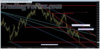
If I am the Whale in this time zone, I push price that last few bars, then hold out my hands as the stop loss selling begins just below the prior Major Swing Low. And for a small moment in time, it will be raining Australian Dollars, right into my hands. And as I feel the selling begin to slow, as I feel everyone is nice and short and much more comfortable [and remember, price is now below the prior lows, so for that small moment in time, those traders feel they have finally caught up with the market and now the big move must be coming...], I 'pull the string'. They were right; a big move is coming.
Just imagine how excited all of you are when Major Swing Highs and Lows are finally broken! Your heart speeds up and if you are already on board for the move, you aren't thinking about taking profit - You're thinking about the 'Big One' that is just starting to gain momentum...And if you aren't on board, you are so caught up in the moment, you have to find a way to catch a part of this move, because it's broken the Major Swing, so this has to be the beginning of the Big One. Trading Plan? Market Context? Market Structure? Who has time for those things? As Carl says, everyone is shouting, 'Oh My God, they just took out the lows!'
The smart Whale says: Wait, I should let Carl finish his Whale Tale!
Click on the image to open the full size version!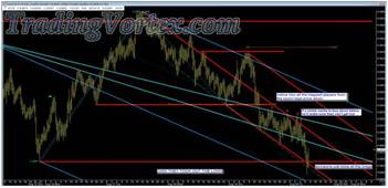
As the selling dries up, the smart Whale calls every market maker he can and buys everything he can; they are happy he called, because they are sitting on huge long positions in a market on its lows. They make the Whale nice prices, nice offers, because they assume the Whale is also calling to sell. The Whale buys more and more and more.
And though price teeters for a bit, suddenly a few of the larger traders figure out what just happened: They aren't long, they are now short at or near the lows and the market has stopped going down.
And when that last wide range bar closes far above the prior Major Swing Low, those few savvy traders get a sick feeling in their stomachs: They've been taken for a ride on a Whale! The market makers were extremely long at or near the lows, and the Whale ate their long positions. The traders that thought the prior Swing Low would hold were stopped out of their long positions - and some of them went short below the prior Major Swing Lows. And of course, the Break Out Traders are short at terrible levels below the prior Major Swing Lows.
One by one, it begins to dawn on all the traders small and big: 'Someone just stole all the longs!'
Click on the image to open the full size version!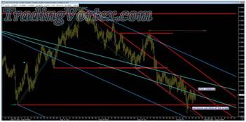
Carl says, 'Price cheers'! This formation is formed by the lucky few that recognize a 'wash and rinse' that was just executed extremely well by a very large Whale; and so, they cover their short positions immediately. If a Whale is feeding down here and he is able to control this market this well, the smart players get out of the way.
And the Whale? He HAD to make certain all the long positions were gone and just as important, all the interest in playing from the long side was gone. These plays work best when you can make it look, for a short moment in time, like only a fool would try to step in front of this train! But when the fool engineered the whole move and is able to build his long position while everyone else is getting ready for the big move lower, he doesn't want anyone else to be long.
Can you guess why? You've all seen this before and many of you have been caught in this train wreck and wondered afterwards what hit you...Why would the Whale want to be the only one long, when the market looks so absolutely terrible?
Click on the image to open the full size version!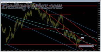
The last bar on this chart says it all: When price breaks out of the congestion and closes above the range that had built up just above the prior Major Swing Low, every trader suddenly understands. As Carl says, 'Oops!' Remember, Carl was short from a beautiful level and he wasn't greedy. As price approached the prior Major Swing Lows, Carl took his money and then took a walk. That was the area he identified when he framed his trade as an area to logically take his profits. And he didn't jump up or do hand stands. He followed his trading plan.
But most of the market got caught up in the moment and went with it! Now, none of them are long and as price breaks above the top of this range, they have to begin covering their short positions, no matter where they entered. If you look at this chart now, it's clear the prior Major Lows held.
If it isn't clear to you, push your chair back three or four feet back and look again. No wait, let Carl finish it for you!
Click on the image to open the full size version!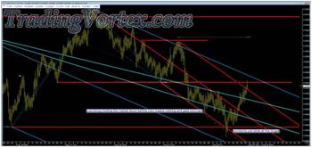
'Everything holding the market down before now means nothing and gets zoomed!' says Carl. And he is exactly right. Look closely and you'll see that when the bar breaks above the range just above the prior major Swing Low, the short game is over. And the doorway out is suddenly very small!
The Whale wants to be the only one long because then more traders will have to chase price higher once they recognize the Change in Behavior. Most of them will grumble and moan about being washed and rinsed but their own greed and poor preparation did them in. If you take the time to make a quality Market Map and then wait patiently for your trade, plan and frame it, and then follow the plan, you will be taking your relaxing stroll or getting a drink of green tea when these 'events' take place - unless YOU are the Whale. Then you will be very busy...
I can't thank Carl enough for such a gorgeous example of an actual trade that has so much going for it - and a set of images so many of you should study over and over!
Please consider starting to keep trading plans before you trade. Start making Market Maps and paying attention to Market Structure and Market Context and then stick with your trading plans. Don't get caught up in the moment, chasing price at its extremes. Plan Your Trade and Trade Your Plan!
Remember, you don't have to be a Whale to play along. If you can read market Structure and Context and know how to read the markets like a Whale, you can spot the Whale tracks and trade right along with them!
I hope you found this beautiful set of images interesting and informative. I hope my commentary did Carl's gorgeous Market Map and his wonderful trade justice. And most of all, I hope some of you learned a little about how Whales think and trade and start thinking about how not to be fish food at these critical levels.
How A Professional E-Mini Trader Finds Great Trades?
We focus on two very important things:
- Our first priority is to help people become consistently profitable traders;
- Our second priority is to teach traders to think about and manage trades like a seasoned professional trader.
I have been a professional trader for forty years and I have been mentoring other professional traders since 1987, and I try to approach every person that approaches me to learn to be a better trader, no matter their level of experience, with those two goals in mind.
It always gives me a great deal of pleasure to watch someone I have been teaching mature into a full time professional trader, and I am proud to say there quite a few traders making a full-time living after either beginning their education with me or after I spent time with them correcting the barriers that had been keeping them from being consistently profitable.
One of the traders I am particularly proud of is Shane Blankenship. Shane spent many years asking questions on my free public forum, then took my Basic Market Maps Seminar and eventually entered one on one Mentoring with me. You can see Shane these days showing his charting and trading skills alongside mine each day, He became such a wonderful chartist and trader that when I recently moved to Arizona, I brought him to help me with the daily live Mid-Day Mentoring sessions. He's been with me six months and become indispensable.
In this article, I am going to show you my re-creations of a week's worth of charting of the E Mini S&Ps Shane showed members live in our Mid-Day sessions, because they tell how a professional approaches the market, prepares and waits for a trade entry, then executes the planned trade flawlessly. I hope you find this set of charts and the story behind them from a recent week in the E Mini S&P futures interesting and informative.
Click on the image to open the full size version!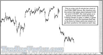
Shane generally charts day only five minute bar charts of the E Mini S&P futures; this means he is often staring at gaps created from the overnight action. Many traders do not like to deal with gaps or have trouble dealing with the meaning of gaps but Shane finds that gaps carry a great deal of information that he can use when 'Mapping' a market.
I tell this story to my students often to encourage them to think 'out of the box': In the early 1980's, one of the largest currency portfolio managers in the world kept three separate sets of data and charts for each Major Area of the world: He would keep data and charts on the New York currency markets, a separate set of data and charts on the Tokyo currency markets and a separate set on the London markets. Odd as it sounds, he would take positions based on the eight hours of the New York markets, positions based on the Tokyo market hours and positions based on the London markets; and yes, at times these positions conflicted. His thinking? Each of these Money Centers had flows that had to be dealt with and his data, charts and positions were based on the flows for each of the three Money Centers.
Back to Shane's chart: The majority of the money that flows through the U.S. stock markets flow when the U.S. 'cash' markets are open, and they are best represented by charting day only session charts. Another way to represent the flow of cash that is popular with larger traders like myself is to chart day only futures that begin at 8:30 am CST and end at 3 pm CST, which mirrors the beginning and end of the New York Stock Exchange's main hours and the majority of the U.S. stock market cash flows as well.
I personally like to chart 13 minute or 39 minute day only charts that begin at 8:30 am CST and end at 3 pm CST, because it gives me a unique look at the U.S. stock market [Yes, I ignore the final 15 minutes of trading of the E Mini S&P futures on these charts, because the cash stock market has already closed]. But these are my re-recreation of Shane's charts.
Click on the image to open the full size version!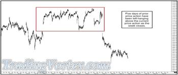
As the week opens, and Shane prepares his charts, you can see that the market left five days of price action above the current price action, on day only charts; this formation, until closed, weighs heavily on the markets and you can see price sold off quite sharply on the following two opens. This chart ends on Friday's close.
Click on the image to open the full size version!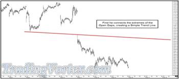
Shane begins by connecting the extremes of the Open Gap, using a Simple down sloping Trend Line.
Click on the image to open the full size version!
Next he looks at the action from the last two days of the prior week and notices an up sloping Simple Trend Line that connects three pivots [a Multi-Pivot Line] and adds that to his chart.
Click on the image to open the full size version!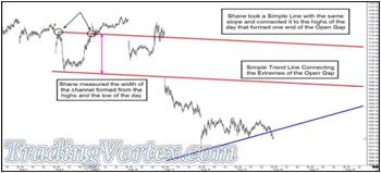
Now he begins to add potentially important details to his 'Market Map'. First, he makes a copy of the red down sloping Simple Trend Line and transfers it to the morning's high of the same day, and notices it catches the close of the day as well; he leaves this new parallel Simple Trend Line on the chart and measures the distance between the two lines.
Can you guess why he would be interested in the distance between the two down sloping parallel lines?
Click on the image to open the full size version!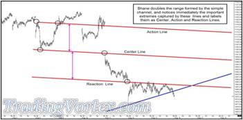
Remember, Dr. Andrews and Roger Babson were students of Sir Isaac Newton, who was a well known Mathematician and Physicist. But Newton was also the most well-known alchemist of his times, and although the term 'alchemist' has fallen in stature these days, most well-schooled scientists know that the alchemists of Newton's days, as well as those that proceeded him, laid the ground work for our most powerful scientific principles. Newton's work, in particular, holds many of the keys to modern physics.
His simple Three Laws of Motion spurred the work of Albert Einstein and Stephen Hawkins and continues to spur Physicists around the world more than 200 years after they were written. And most physicists believe his inspiration came from a treatise written at least several thousand years earlier, 'The Emerald Tablet'. Newton's translation of this simple alchemical work is still used as the best and most useful translation. When we look at its most well-known phrase, 'As above, so below', we may be looking at the inspiration for Newton's best known Law of Motion, 'For every Action, there is an Equal and Opposite Reaction'.
I marked where price interacts with these lines to make it easier for you to see why Shane might use these types of projections, as well as to spur you to ponder how these same lines may come into play later.
Shane measured the distance between the parallel down sloping lines and then projected that distance forward [or downward, in the probable path of price]; then he placed a Simple Trend Line with the same slope at that distance. The original red down sloping line was the Center Line, the line that captured the frequency of price, it was a Multi-Pivot Line as well. The Simple Trend Line above captures the first swing or pivot prior to the Center Line; this measures the amount of energy price can carry forward from the Center Line when it 'Reacts'. And of course, by projecting forward a line with the same slope with the same distance below the Center Line, Shane now has a first Reaction Line, where price will have spent an 'Equal and Opposite' amount of energy; as Newton translated: 'As above, so below'.
Click on the image to open the full size version!
Still working on his 'Market Map', Shane performs the same exercise with the up sloping blue Simple Trend Line: he copies the slope of the Simple Trend Line drawn from the low of the Gap Opening and adds a new Simple Trend Line with the same slope to the high of that day; this will serve as his Action Line and the original blue up sloping Simple Trend Line-also a Multi-Pivot Line-acts as the Center Line. Now he simply measures the distance between the two lines and projects it forward [in this case it projects below price, because that is the probable path of price and the natural path of a 'Reaction'] and then adds a new Simple Trend Line at that distance, below the current price structure. This new blue up sloping line will act as the Reaction Line, a measure of where price will have expended its reaction energy off of the Center Line, should it continue lower, and so it is named the 'Reaction Line'. He also adds a second red down sloping Reaction Line [I'll label it R2] in case price continues much lower.
He then adds a horizontal black Simple Trend Line - a Multi-Pivot Line - that connects the high of the Open Gap and a handful of upper pivots. Shane has his Market Map for the upcoming day and is ready to see the opening action, and ready to look for the high probability trade set ups he uses when he trades this market in this time frame if one begins to develop.
Click on the image to open the full size version!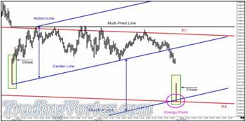
This chart shows a zoomed in version of Shane's Market Map, along with the first five minute bar of the day session; when this bar closes, it is 8:35 am CST on Monday morning.
I highlighted two particular bars: both wide range bars and both bars that gapped open quite a bit to the down side. Note that in both cases, once the 'morning imbalances' are smoothed out by the market makers in the U.S. stock market, both in some individual stocks and in some large portfolios, the selling dries up. Then the larger traders, the Whales, begin buying out right, pushing the stock indices higher. They are trying to drag mid-sized and smaller retail players into having to chase these markets higher, in case price does indeed go high enough to fill the Open Gap. Look at the close on both extremely wide range bars: Price closes at or near the bar's highs.
But let's look carefully at Shane's Market Map. Remember the blue up sloping Reaction Line he added before the market opened? This up sloped line was based on a Multi-Pivot Line, in this case a Center Line, and the distance from the Center Line to the prior high pivot, which he had used to form the Action Line. As Newton would say, 'As above, so below'. Look at where price turned after the extremely wide range lower gap: Right at Shane's blue up sloping Reaction Line. And that's why he projected that line forward: 'For every action, there is an equal and opposite reaction' and if price sold off on Monday morning, an equal and opposite reaction from the Action Line, projected from the Center Line and its frequency was reflected by the up sloping blue Reaction Line. But that's far from the end of projections contained in Shane's Market Map.
I have been researching and teaching the concept of Lines of Opposing Forces, or Energy Points, for quite some time; I am proud to say it's one addition I have made to Technical Analysis. These Energy Points act as Price Attractors and often serve as areas where price makes a 'Change in Behavior'. I don't use them to anticipate turns in Price; instead I mark them and watch those areas carefully for price to exhibit Changes in Behavior.
In this case, you can see that Shane's red down sloping Second Reaction Line [R2] and his up sloping blue Reaction Line [which are Lines of Opposing Force or Lines with Opposite Slopes] cross at the area that coincides where price does indeed Gap Open, and price shows a Change in Behavior by forming an extremely wide range bar that closes near its highs. In many ways, you can think of these Lines of Opposing Force projecting a sense of a time where Price MAY exhibit a Change in Behavior. And in this case, Price and Time came together, and a Change in Behavior seems to be happening.
Click on the image to open the full size version!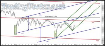
Although Shane's Market Map going into Monday's trading was 'picture perfect', he did not see a high probability trade entry set up that he uses on a regular basis to allow him to enter a trade. The majority of traders feel they must have an open position if they are watching the market; successful professional traders learn they survive and prosper by taking trades that have a successful outcome for them on a consistent basis. There are often days that go by when they 'know' where the market is likely going, but they have no edge, no acceptable money management stop or they don't see a high probability trade entry set up they use and so they don't take a trade.
We have seen that when we show live action and 'bar by bar' replay during our Live Mid-Day sessions, mid-sized and retail traders find it at first surprising that we watch without positions even when our Market Maps are so accurate that particular day and then they find it comforting, because it takes some of the pressure off of them to always have a position any time they are in front of the screen watching the market. At the end of Monday, Shane made a single addition to his Market Map from Sunday night: He added a green up sloping Median Line [or pitchfork] to project the probable path of price if Monday's Gap Open Low was indeed a significant low and price continued higher Tuesday.
Click on the image to open the full size version!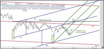
Tuesday, Shane took a personal day away from trading and wasn't present at the Live Mid-Day Session. But we all peeked at his Market Map from the night before to see if it had any relevance to Price. You can see that price Gapped Open higher, above the blue up sloping Center Line, above the red down sloping Reaction Line, above the green up sloping Median Line and above the black horizontal Multi-Pivot Line. If you push your chair back and look at the chart, you'll see Price gapped open above an area where these all meet or clump together - and you should consider this a form of Energy Point. This area is a Price Attractor, but you have to watch Price for it to tell you how it is going to react at this Energy Point.
Dr. Andrews, one of my early Mentors and the person that gave us Median Lines and did years and years of research on Action Reaction Lines, taught that if price zoomed through a Median Line, it would come back and test the same Median Line. This is one of the high probability trade entries we teach, after we put in countless thousands of hours of research on various Median Line trade entry set ups. Now that price has gapped or zoomed above the Median Line, you can buy the retest of that Median Line; in this case, there was no acceptable initial stop loss at this point, so I would personally pass on the trade.
But Price has left a poke with a double bottom formation that did recently test this up sloping Median Line. IF price retested the Median Line again within the next three to five bars, I would buy a retest of the Median Line [and in this case, a retest of the Multi-Pivot Line and blue up sloping Center Line as well] with a stop roughly five E Mini S&P ticks below the prior test, which was the low of the day.
Click on the image to open the full size version!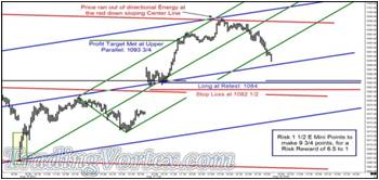
This is a set of Shane's Market Maps from the week, but I could not resist showing the gorgeous trade opportunity he had prepared for when he did his Market Map the night before; again, he had personal business to take care of, and did not trade this day. But this is how I would have traded his Market Map [I could have written that Shane took this gorgeous trade or that I took it, but again, our focus is to teach people interested in trading how to trade and manage their trades as professional traders - and there are simply days when you have other things to do, or you miss a set up.
There's no shame in that! That's life as it really is! I know showing potential trades we missed or losing trades, as well as teaching people how to set up Market Maps and become consistently profitable traders takes a great deal of emotional pressure off of them; professional traders miss trades. There will always be another trade. And even the best professional traders have losing trades 35 to 40 percent of the time. If you can keep your Risk Reward Ratio high enough, you can make a very good amount of money with a winning percentage approaching fifty percent.
I note the high Risk Reward on the potential trade set up [6.5 to 1] and I also note that when price did turn lower on the day, it was right at the red down sloping Center Line from Shane's Market Map, a line he added to his charts Sunday night.
Click on the image to open the full size version!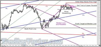
The cascade continues lower to test the black horizontal Multi-Pivot Line that begins with the original Open Gap; what was resistance has clearly become support and you can see though price tested this horizontal line, it then turned higher early Wednesday morning and climbed back to retest the red down sloping Center Line that had stopped the rise in Price the prior day, Tuesday. Shane waited patiently for a trade set up he recognized and he didn't see one until late in the day on Wednesday.
When price began to show weakness by breaking out of a tightly coiling or congesting formation to the downside, he added a new down sloping Median Line. Although there was only a bit more than an hour to trade, he wanted to sell a test of the Upper Parallel IF price climbed back to test that high, with an Initial Stop Loss order above the high of the day. His Profit Target would be the down sloping Median Line, which was more than ten E Mini S&P points below where he wanted to enter, so this potential trade would have a Risk Reward of about three to one.
Click on the image to open the full size version!
The sell off accelerated and never let Shane into the trade. You can see that even with just over an hour left to trade in the day, the 'imbalances' pushed Prices quite a bit lower; he had the right idea but sometimes, Price doesn't allow you to enter at a price with an acceptable stop loss, and chasing price in a running market is usually a losing proposition. Again, we strive to teach traders to trade and manage their trades as professional traders manage their trades.
Thursday also brings no action that Shane finds interesting enough to open a trade in the E Mini S&Ps. But by Friday's Live Mid-Day Mentoring Session, he is watching and carefully watching an area where IF price is going to exhibit a Change in Behavior, it will probably be here.
Click on the image to open the full size version!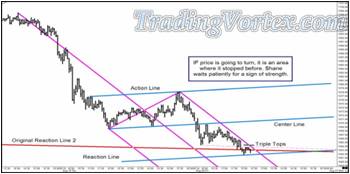
This is the price area, off the original Reaction 2 Line, where the early week rally began. Price has left some markers, triple tops and a Multi-Pivot Line connecting some bottoms and tops, that Shane is watching closely. If he sees Price show strength and can find a trade entry set up with an acceptable Risk Reward and Initial Stop, he'll attempt a trade in this area.
Click on the image to open the full size version!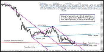
Once price breaks above the triple tops, Shane feels confident the Original Reaction Line 2 will hold, as it did earlier in the week. He diagrams his trade out live in the Mid-Day Session. This trade will have a Risk Reward of four to one, which is quite nice. Risk Reward Ratios above three to one really help keep your trading account balance healthy.
Now Shane has to wait to see if Price will fill his Limit Buy order and give him a trade, winner or loser, in the E Mini S&Ps this week.
Click on the image to open the full size version!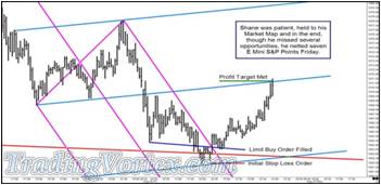
Price finally let Shane into a trade in the E Mini S&P futures just after the Live Market Maps Session ended Friday afternoon. He netted seven E Mini S&P points on this trade, which had a very nice Risk Reward Ratio of four to one. And although many people might think he spent the week kicking furniture because of missed opportunities, he had several nice trades in the U.S. Ten Year Note futures, so in truth, he had a very nice week trading.
How do we deal with it? We make our Market Maps, study the markets, do research, and manage the trades professionally that the market allows us to enter.
I hope it was interesting watching an entire week's set of charts and potential trade entries from a trader that I taught and mentored. He's now a full time professional trader and I certainly respect his charting abilities, as well as the way he has mastered himself, which is the most difficult part of becoming a consistently profitable trader.
How To Train Your Eyes To See Charts Like a Pro?
Several years ago, I spoke at a Traders Expo in Las Vegas and showed a chart and made a comment in an interview that the Dow was on the way to testing 7200; the Dow was nearly 14,000 at the time. I stated that should that area give way, the Dow should head down to test the support at 6500 and perhaps even the Major Support at 5500. As we all know, Lehman Brothers failed shortly after that interview and a major sell off in the Dow began, ending in a low right around 6600. After the selloff, I was interviewed again and asked if the sell-off was going to continue. I answered that there seemed to be two possibilities in my mind:
- The sell-off would intensify and test what I considered to be Major Support at 5500 [some people were calling for 2400 in the Dow!]. Then prices would stabilize and we would trade in a wide range for the next 3-5 years, as investors sorted through the surviving companies, and 'real' value was identified.
- Or as in Japan, the bearishness was so pervasive and the Government was so willing to pump trillions of dollars into an economy with little or no demand that we may have seen the lows and were now entering into the long period of consolidation. This period should be marked by a partial recovery of the market and then a long period of range trading, while companies either recovered in value or simply disappeared.
In either case, I said, we should be entering a long period where commodities, currencies, and interest rate instruments would be the markets where real sustainable movements occurred. This period might last as little as five years but could easily stretch on for another fifteen or twenty years. As a student of history, I know that if one area of the economy [stocks, in this case] remained relatively stable in movement, money flows will seek out volatility, because that's where money is made, that's where you'll be able to track the true flows. And that's what we have seen.
The stock market has been relatively well behaved, while the real moves have been seen in the commodity, currency and interest rate markets. I have been telling my Mid-Day Session members for over a year to grab the 'easy' money off the table in the bond and note futures, and I want to diagram out the Market Structure, context and a simple entry set up I have shown in a prior article to get on board these moves, whether you are looking for eight ticks or 100 ticks!
Click on the image to open the full size version!
Here's a U.S. Bond futures chart that I haven't marked up yet. Does anything catch your eyes? You'll need a focus point or area to begin with. Did you find one? Draw it on the chart [You can draw it mentally on the chart or literally print out the chart and draw it in!]
Click on the image to open the full size version!
This simple Multi-Pivot Line cutting across the action caught my eye first. By drawing in this line, my perspective has changed and the price action begins to come into focus for me. Did you see this line? Now that you see what caught my eye, if you didn't see this line, add it to your chart. Does it clarify your focus of the current price action? Let me 'pull back the curtain' and show you what I see now that my perspective and focus has changed.
Click on the image to open the full size version!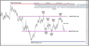
I added another Multi-Pivot Line and marked the Swing Highs and Lows. Then I watched the market a bit more to make certain my perspective was meaningful.
You see my perspective. Maybe you have your own perspective, a different perspective on this same chart. That's what makes markets! Where do you think this market is headed now? You have my 'Market Map' in front of you. Can you see the probable path of price?
Click on the image to open the full size version!
Is price likely going to break the current lows and begin a run to test the prior Major Swing Low?
Click on the image to open the full size version!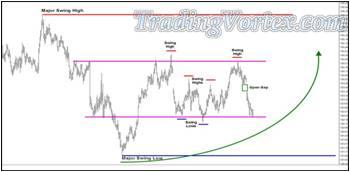
- Is price likely going to head higher and test the upper Multi-Pivot Line and perhaps even break above the recent Swing Highs, heading for a test of the prior Major Swing High?
- Are there any clues on the charts in front of us that may give us a clue to the likely direction price will take from here?
Click on the image to open the full size version!
When I focus in on the action between the higher and lower Multi-Pivot Lines, I notice that the inside Swing Lows that were lower and lower have been broken to the upside; I added a dotted Change in Behavior Line connecting these broken Swing Highs with the low of the prior Gap. I also notice that I could have drawn the same action in on the high Swing Lows that follow.
Can you see where that up sloping line should have been drawn and where it was finally violated as price failed at the upper Multi-Pivot Line? If you can't see it easily, print the chart out and mark the Swing Lows on your chart and connect them with an up sloping line that touches the bottom of the current Open Gap. The more you practice drawing and marking out Market Structure like Swing Highs and Lows and Double Tops and Bottoms and Open Gaps, the better a chartist you will become; and again, your trading will improve as you practice.
I see one other clue. It isn't much but it may be of interest, depending on how a trade was framed out: Price is testing the area where it should run out of directional energy, right at the Multi-Pivot Line. You can see the upper Multi-Pivot Line has held; even though it had one nice poke through, price has failed at the upper Multi-Pivot Line. Now price is at the lower Multi-Pivot Line and again, it had one poke through but that move lower failed and so this Multi-Pivot Line has done a good job showing where price should run out of directional energy.
- Can we use this small clue?
- Do you have any ideas?
- Can you frame a trade looking at this chart?
- Let's zoom in for a closer look.
Click on the image to open the full size version!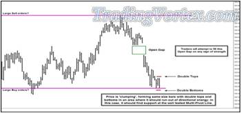
When I look much closer and focus on details as small as how each bar unfolded and even how each bar opened and closed and its high and low, I see a few more clues:
- I see an Open Gap above the current price action, and I know larger traders love to push prices to fill Open Gaps given any reasonable opportunity.
- In the last three bars, I see a set of Double Tops and Double Bottoms; this is a sign of price 'clumping'. When it happens in an area where price is expected to run out of directional energy, I pay close attention.
- Can you frame a trade now in your mind? Plan it out.
- Which way do you think price is headed?
- Where would you enter?
- What would your initial Stop Loss order be placed?
- What is your Profit Target?
- Are you going to use a Single Profit Target or Multiple Profit Targets?
- What is the Risk Reward Ratio on your potential trade as you've just planned it?
Let me add one more set of lines before I show you how I would frame out a trade in this area.
Click on the image to open the full size version!
I zoomed back out and added a traditional Median Line, using the prior Major Low as Pivot A, the single 'poke' above the upper Multi-Pivot Line as Pivot B and the current area of clumping as the 'potential' Pivot C.
As soon as I draw in the blue Median Line and its parallels, I pull my chair back from my desk three or four feet, close my eyes for a few moments, and then open them and see what catches my eyes.
- Try it. What catches your eyes?
- Do the lines I've added help your focus?
I see the blue up sloping Median Line and notice it caught the last touch of the upper Multi-Pivot Line perfectly. Price tested it at the confluence of the Median Line and the Multi-Pivot Line and ran out of upside directional energy, exactly where this methodology tells us it should.
- That means that after marking out Market structure [my first priority],
- then focusing on the context of the current market [my second priority],
- I added a set of sloped lines that caught frequency near perfectly [my third priority].
I should have all the pieces in place. Let's see if I cam frame a trade!
Click on the image to open the full size version!
There are lots of decisions to be made on this potential trade! To me, it is setting up as one of my favorite entries, a Corner Trade, one of the 'Bread and Butter trades I developed for my own trading and use on a regular basis. Corner trades work best on the bond and note markets and I developed them to be extremely high probability trades, so using smaller Risk Reward Ratios are acceptable to me: My statistics show that price gives me the minimum target of 8 ticks on Corner trades 80 percent of the time when they are taken at areas where price should run out of directional energy. Market Structure and Context are really the key to correctly identifying these trades; if price is clumping or grouping but there is no Market Structure or Context to support an entry, it has a much lower probability of success.
Let's evaluate the situation as I see it:
- Price is forming a clump or grouping at an area where it should run out of directional area, as well as at an area where it has found prior support: The lower Multi-Pivot Line. This is a classic Corner Trade Entry Set up.
- The minimum price target = eight ticks, is at the double tops, so price will not have to take out the double tops before I either take my eight tick profit OR move to a break even Stop Loss order, collapsing my risk.
- Should price break above the double tops, the larger traders [the Whales] should try to push price higher to fill the current Open Gap, at 123 28 - allowing me to consider taking partial profits just before that, at 123 26.
- If the Open Gap is filled, the next logical target would be just below the prior Swing High, when price tested both the blue up sloping Median Line and the upper Multi-Pivot Line, at 124 16.
- Median Line theory tells us price should make it back to re-test the Median Line 80 percent of the time, once it starts to break above Market Structure. By breaking above Market Structure, price is showing us there are buyers in the market. If price ran directly to the Median Line in the next bar, price would intersect with it at 125 03.
- The one negative I see in this potential trade set up is the size of the initial Stop Loss order. I always try to place my orders above or below Market Structure, to allow the build up of Limit Entry or Limit Exit orders from the larger traders [the Whales] to act as a buffer for protection. In this case, I will have to use an 8 tick Stop Loss order to hide underneath the one 'poke' below the lower Multi-Pivot line. This is as large a Stop Loss order as I would use on a Corner Trade Entry, and I am unlikely to take the trade if I am only interested in taking my profits at the minimum target of 8 ticks; to take this trade, I have to feel it is realistic to set my Profit Target at one of the higher areas of perceived resistance.
- How would you frame this trade?
- Is it worth the 8 tick risk?
- Which is $250 per contract?
- If you like the Corner Trade Entry, which Profit Target would you use?
- Would you use multiple Profit Targets?
- What is your Risk Reward on the trade you framed?
Click on the image to open the full size version!
Because I would only take the Corner Entry Trade if I thought it would be able to realistically reach the Prior Major High, if not the Median Line, I was not interested in taking profits at the minimum target at 8 ticks. But you can see that any of the Profit Targets I outlined would have worked, and if you had taken profits at some of them, you would have missed sitting through some significant pullbacks in price.
Yet using the simple idea of moving my stop profit order underneath each Swing Low as it was confirmed by a higher high to 'box in profits' allowed me to stay in the trade and ride it higher as price continued towards the Median Line. The original maximum Risk Reward Ratio on the framed trade was 75 ticks if price had gone to the Median Line in one bar, a Risk Reward Ratio of over nine to one; the actual Risk Reward ended up at sixteen and a half to one, for a net profit of 132 ticks, which is $4,125 per contract [132 X $31.25] !
As I stated several times, the more you practice drawing in Market Structure like Swing Highs and Swing Lows, Gaps, Multi-Pivot Lines, as well as take the time to consider where large traders [the Whales] may have left their orders, the better your trading will become.
In the next article, I'll show you a similar high probability entry and a 'second chance' entry when trading bond and note futures, in case you miss the first opportunity for the trade or are uncomfortable with the initial Stop Loss order.
I hope you found this article interesting and informative. Take the time to practice drawing and planning out your trades and your net profits will grow accordingly.
How I Stalk My Trades To Find Good Entries?
Most traders are focused on entries and are sadly unprepared when it comes to Market Structure, Money Management and framing their trades to give them Solid Risk Reward Ratios and reasonable Exit Targets. Everyone is afraid they will miss the 'big move' and so they focus entirely on complicated entry techniques, techniques I would contend that give them many false signals; to me, simple is better and often, less is much, much more.
Watch how I stalk a trade using extremely simple lines, solid money management and Risk Reward. I pay strict attention to Market Structure, down to the detail of how each bar unfolds, the range of the bar, the relative length of the bar and where the bar opens and closes; if it sounds like work, it is! Trading can be quite tedious and I would never turn my own capital over to a curve fit indicator or model, I'll trust simple lines and solid money management over them every time.
Click on the image to open the full size version!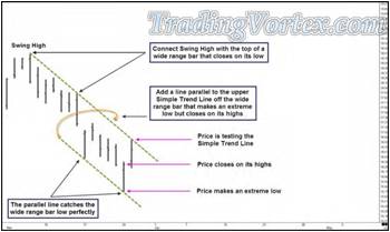
Here is a wonderful example of using simple lines to make a Market Map. You wouldn't leave on a trip to a new destination without a map in your car, would you? You shouldn't trade the markets without first mapping out the major Market Structure and the defining characteristics of the current market: because you may have ideas about where the market is going but you never know where it is going.
Always remember that price is always right and price goes where it wants to go. But there are markers we can read that will show us the likely path of price or show us signs that the market has just done something significant. Learn to pay attention to these signs!
On this chart, price was in a nice orderly down trend, in a formation I named a Rolling Chop many years ago. It is testing the Upper and Lower set of Simple Trend Lines that have the same slope. These lines differ slightly from simple channels because of how I 'found' the correct slope and applied these lines. Let me explain: I used the Major Swing High and connected it to the high of a wide range bar that opened near its low and closed on its low. This type of bar is a marker for weakness. Now look at the next bar: It, too, was a wide range bar and it gapped lower, opening on its high and making a new low for the move. But then it rallied to close on its high and this is a sign that there are buyers in that area.
Even though price seems to be in a down trend, I don't ignore that price just made a wide range bar, opened on its highs and closed on its highs; instead, I copy the slope of the down sloping Simple Trend Line drawn from the Major Swing High and add a new down sloping line from this wide range that closed on its highs. This bar represents the 'buy area' of this Market Map at the moment, but it's important to understand the buy area moves lower as each bar unfolds, because price IS in a down trend. People that follow my work have heard me state countless times that you have a ten percent edge when you trade with the trend, when you trade in the same direction of the slope of the lines on your Market Map. In a down trend, support areas [other than support from pure Market Structure] and profit targets tend to move lower as space and time moves on; the opposite is true in an uptrend.
There's an important line drawn on this chart that I purposely did not name or point out. See if you can identify it!
IF price is going to remain in this down trending Rolling Chop Formation, there's a line price should not significantly violate. The pullbacks to this line are the pendulum swings that define the back and forth action of a moving or rolling market.
- But what if the pendulum swings go too far?
- Do you see the line?
- What would it take for you to suspect that this Rolling Chop Formation has been violated so far that it is no longer valid?
You should have your Market Map in front of you and be looking for road signs, as well as signs on the road that trouble may be ahead!
Click on the image to open the full size version!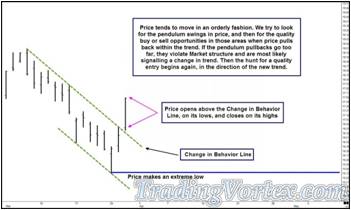
Price opened higher and traded higher all day, closing on its high. Look closely at the dotted green down sloping Simple Trend Line price opened above: This line had been defining the Rolling Chop Formation on the top side, but if price was moving in a less orderly fashion, it would represent what I call the 'Change in Behavior' Line. When price opens above this down sloping line and trades higher, closing above it, it's a sure sign of warning for traders that think the market is in a clear down trend.
Is the down trend over? No, no material damage has been done to the overall down trend. No Major Swing Highs have been broken to the up side; but the Rolling Chop Formation and its trade plan are dead.
As you look at the chart below, you should be drawing a Market Map [either in your head or you can literally add the possibilities onto your live chart] that maps out where price may run into resistance. And it's important to decide when projecting that area of resistance just how important that area is:
- Is it an area where Limit Entry orders are likely to be waiting?
- If so, do you want to consider looking for an entry set up for your own account in that area?
Click on the image to open the full size version!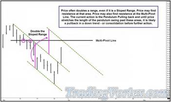
Is the area a key to the probable path of price?
If price brings the pendulum to this level and this level is a 'make or break' area for the trend, you should be deciding what you want to do at this key level:
- If you like the Market Structure and price action that brought price to this key area, it's a wonderful place to enter for a potential reversion to the trend [if you have a quality entry set up and stop] because your entry will be 'close to the bone', meaning you will have entered well before most traders take positions in the direction of the trend and will most likely have a much better entry price.
- If you don't like the way price headed toward this key level, 'buy another bar' or two, which means watch how price acts when it gets to this area. If price begins to stall at this key level and build Market Structure you are more comfortable with, begin looking for a trade entry set up, though these areas often spawn quick turns IF price is about to return to the prior trend, so by waiting for more information, you may miss a 'close to the bone' entry.
- If you are uncomfortable with the price action that brought price to this key level and you see nothing that relieves that uncomfortable feeling, stay out, don't waste too much of your focus on the market. Wait until you see Market Structure you can 'see', that you know you can trade successfully, before spending time, energy and money on this market.
On the chart above, I added my Market Map and marked out what I thought were two key possibilities if price continued higher:
- Price often doubles a range, even a Sloped Range, and then returns back to the prior trend.
- Price often runs into Limit Entry orders at a Multi-Pivot Line. These orders are left above the current price action by the larger traders [the Whales] in a down trend, in case price pulls back to levels that give them a quality entry on a pendulum type pullback [and the opposite in an uptrend, of course].
Click on the image to open the full size version!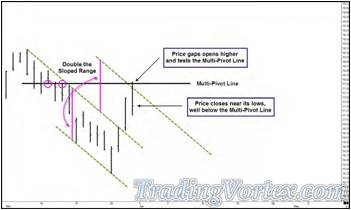
Price gapped open higher, rose to the confluence formed by the Multi-Pivot Line and the down sloping line that marks the area where price effectively doubled its 'Sloped Range' and then turned lower. To stay within the down trend, price could only stretch the pendulum back that far, any further would have violated the key Market Structure; at least for now, Market Structure and potential Limit Entry Sell orders turned price back towards the down trend.
Click on the image to open the full size version!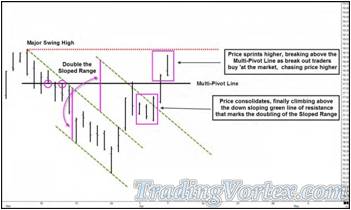
The return to the down trend does not last long. Price consolidates for a few bars, drifting higher and above the down sloping green line that mark the doubling of the Sloped Range. Once above this level, price accelerates its climb and when it trades above the Multi-Pivot Line, break out buyers and stop loss buying propel it even higher, these are the traders chasing price as it moves higher, either by choice or because they must exit their short positions.
There is one last obstacle in price's upward path.
- Do you see it?
- Do you think price will have the strength to move above it?
Price fails to trade above the Major Swing High; after failing, it turns back lower. But the green down sloping line that had been resistance now acts as support and after a few quiet bars, price turns back higher again. I call these areas that 'switch allegiance' Switchbacks and they are quite useful once you get used to looking for them. They often give you further important clues on your Market Map, clues most traders do not have.
Click on the image to open the full size version!
IF price manages to break above the Prior Major Swing High, we will have seen a Change in Behavior and should be wondering if price has already begun a new up trend; should this happen, we'll have to completely revise our Market Map.
Click on the image to open the full size version!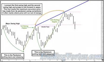
Price does climb above the Major Swing High, so I completely revise my Market Map. I mark the Pendulum Swing Pullbacks - note the second pullback is not as deep as the first pullback - and then I connect the lows and highs of the first and second swings higher to make them easier to see.
Now let me show you something I haven't marked on a chart shown publicly before: When price makes these Pendulum Pullbacks that are easy to spot, connect the extremes generated by the first two pullbacks with a Simple Trend Line and project it out in space. This line marks just how far price is rocketed higher by the 'slingshot' effect once the cocked Pendulum is released. Because the lengths of the Pendulum Pullbacks and the swings following them are not equidistant, the line has a slope. This sloped line shows the maximum excursion away from the swing lows and by connecting the first two extremes, we often get a very accurate measurement of where price will run out of upside directional energy.
Here's an updated Market Map. Price made an even shallower pullback and then a new high for the move, but note it didn't make it high enough to test the Maximum Excursion Line; the air is generally thin up there. Price had expended all its directional energy on that run up and when it turned lower, it left a huge Open Gap lower, followed by an extremely wide range bar that opened on its lows but closed near its highs-clearly there were large Limit Buy Entry orders when price fell in a near vertical fashion after the Gap.
Click on the image to open the full size version!
Remember, traders [especially large traders] love to push price to fill an Open Gap, especially if they can sense the 'crowd' is caught leaning the wrong way. And after that huge Open Gap lower followed by an even larger Gap Open lower, there were no mid-sized or smaller traders long this market. Many had been stopped out of their long positions at very painful prices and some had even gone short after the Open Gap. Only the Whales were left to buy this market. If they were long, they were adding at these lower levels.
If they missed the original run higher, price was approaching the area where price would most likely run out of down side directional energy. You can see where I added in what I consider to be the Change in Direction Line; until price begins to form mature Market Structure below this line, price was swinging, and swinging wildly, but it was still making higher highs and staying above key Swing Lows.
Click on the image to open the full size version!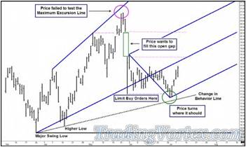
Price turned just about where it should have turned. Could you have entered there? There were many reasons to expect a turn in that area, but the size of the stops and the wild last vertical fall may have kept many savvy traders from taking this trade, at least 'close to the bone', right at the 'C' Pivot of the up sloping blue Lower Median Line Parallel. But the Whales were buying there, and you can see they immediately began 'pulling the string' on any traders that attempted to go short this market prematurely: because price was still above the Change in Behavior Line.
- Do you think price is headed higher from here?
- Do you think price is going to continue to trade in a range now?
- Do you think price will plunge and break through the Change in Behavior Line, leaving the Whales stranded?
Price continues higher, not only breaking out of the current range but breaking out in style, with an Open Gap higher! Price briefly consolidates, catching its breath, and then heads higher again, in a near vertical fashion.
Click on the image to open the full size version!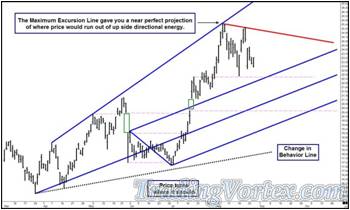
Price finally tests the Maximum Excursion Line and you can see this line, drawn from the first two Swing Highs of this move higher, call the turning point as perfect as possible.
Does this tool always catch the exact top? No, it's not realistic to think any tool works one hundred percent of the time.
I don't place my Limit Exit orders [my profit orders] at this line, instead, I use Market Structure or run trailing stops under prior Swing Lows to box in profits; or I may use Euclid's Expansion series and measured moves or Median Line projections. But I keep this simple line on my charts whenever I can clearly see the Pendulum Pullbacks in a trend. I use it as a warning, much as the ancient Greeks had a servant standing behind them, whispering in their ear that 'Fame is fleeting'; in this case, it is a warning that the closer price approaches the Maximum Excursion Line, the more likely price is running low on directional energy. My first floor broker, and still one of my closest friend, used to say to me, 'Get in, get out, no one gets hurt', as a sort of mantra to me to frame my trade and get my money out before the rest of the crowd headed for the exits. This type of thinking has always served me well. I would rather have some money in my pocket and leave some money on the table for others to fight over then let slip away what was in my hands. This is a simple line all of you can draw and if you practice, it can improve your profit taking decisions dramatically-literally from the first day you begin using it.
Using Simple Box Formations For Big Trading Profits:
One of the simple visual techniques I teach my newer and younger students [and one I use in my own trading] is the power of simple box formations. These 'boxy' formations [ranges, congestion, Energy Coils] become very easy to spot once you start marking them and observing their behavior.
But too many traders don't pay attention to boxes or ranges and end up entering a trade because they are following a lagging indicator that gave them an entry signal or because they were following a line, had their mind set on a trade idea and never recognized the box or congestion forming. I have a term I use with more experienced traders [generally a bit more mature in age] to describe entering a trade in the middle of a box or range: 'Trading in the Killing Fields'. These traders may have the right idea, but the range usually ends up running their stops and they usually end up on the sidelines watching price move without them.
Here's one of my charts that I'll use to show you how I use boxes, but the idea for these particular boxes and the eventual trade entry came from my son, Sean. These are daily bars and I'll tell you the instrument at the end of the article, so you can look at price action and try to 'read' what it is going to do, without opening a current chart.
Click on the image to open the full size version!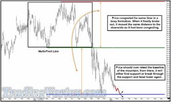
Note the box formation I drew in the upper left hand portion of the chart. This is price trading within a range, restoring spent potential energy, much like a car's gas tank getting filled while it sits still at a gas station.
There is one excellent clue to the likely direction price is going to break out of this box formation. I purposely did not mark it on the chart.
Can you spot it?
After trying to retest the prior Major Swing High, price failed and turned lower, a sure sign that there were large Limit Entry Sell orders at or near the prior Swing High. These are orders left by the largest traders, the 'Whales'. You can see that every time price attempts to test that prior high, it fails. Price is running into the Limit Sell orders left by the Whales. After a feeble third attempt, price trades a little lower and then the significant event takes place.
Do you see it now?
Price Gaps significantly lower and eventually trades down to test the Multi-Pivot Line, filling in a simple formation I call a 'Mountain'. Even though it climbs quickly out of the hole and fills the Gap, after three higher highs, it leaves double tops and then turns lower again and heads straight to a test of the Multi-Pivot Line.
The first time lower, after price Gapped lower and filled the Mountain Formation, there were Limit Buy orders at the Multi-Pivot Line, again, left by large traders [Whales] because traders likes to fill Gaps. The Whales were already short near the highs of this formation, so it would not be unusual for them to lock in profits as price re-tested prior lows.
But if you look at the quality of the rally that followed the first retest, you can see it never made it anywhere near the prior Swing High; if you were a Whale or large trader, you might be less inclined to take profits on your short position or to establish new long positions at the Multi-Pivot Line until you watch the price action in that area.
Now look carefully as price heads lower again towards the Baseline of the prior Mountain Formation, which also serves as a Multi-pivot Line: Price has no difficulty breaking through to the downside. The Whales pulled their Limit Buy orders! You really can trade with the Whales if you just know how to look for their tracks, by the way, I know because in some markets I am one of the largest traders making me by definition a Whale. Note that once price breaks below the Multi-Pivot Line, which had acted as support, the line now acts as resistance. Price tries to get above it and close above it several times but fails.
Can you guess why?
Yes, the Whales don't have Limit Buy orders at the Multi-Pivot Line now. They have lowered their Limit Sell Entry Orders from the area of the Major Swing High down to the Multi-Pivot Line area. It always sounds so simple, but it works so often: What was support has become resistance. This is part of the inner workings that make ranges form. And it's another reason why price often doubles the prior range. And if you look at the current chart, price doubles the range just about to the penny and then turns back higher.
This shouldn't surprise anyone. Sir Isaac Newton, the famous Mathematician and Physicist, was also an Alchemist and devoted a great deal of time translating books written literally thousands of years before he was born, books written by the Egyptians, the Greeks and the Phoenicians. His translation of 'The Emerald Tablet' is still the favored translation of that important text today. Many feel he was inspired by the Emerald Tablet when he wrote his three Laws of Motion, as evidenced by this oft quoted phrase, 'As above, so below.' Many see this simple four word phrase as the precursor to Newton's famous, 'For every action, there is an equal and opposite reaction'.
And of course, price indeed makes an equal and opposite reaction, if you look at the Multi-Pivot Line in the center of the chart as the Center Line, the Major Swing High and a line drawn horizontally from it as the Action Line and then project the distance from the Center Line to the Action Line back underneath the Center Line, you get a near perfect Reaction Line: 'As above, so below'.
Click on the image to open the full size version!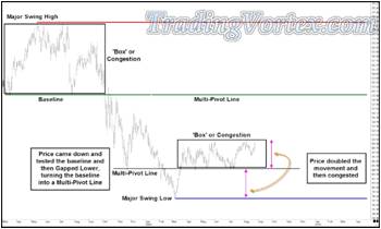
When price comes back to fill the Mountain Formation, re-testing the lower Multi-Pivot Line [which is also the Reaction line], you can see that once it filled the Mountain by re-testing the Baseline, it gapped lower through the lower Multi-Pivot Line and continued lower. You can assume the Whales that were short waited to enter Limit Buy Orders to see just how many smaller traders were caught long - and how much lower their stop loss orders would push this market. But at some point, the selling dried up and a 'V' bottom formed, with price turning back higher and rallying just as fast as it sold off.
- What would smaller traders find when price approached the lower Multi-Pivot Line from below as price rallied?
- Would prior support now be resistance?
- More tomorrow in Part 2
Let your eyes go back to the lowest point on this chart, the [now] Major Swing Low. Erase all the price action to the right of this low from your mind and imagine this bar unfolding in front of you, in real-time.
- What are the market positions of the mid to smaller players?
- Which way are they leaning?
As the bar unfolds that will eventually prove to be a significant low, mid to small traders may have tried to hold long positions on the way down at several areas of assumed support but unless they never use stops and have unlimited capital in their accounts, they have either been stopped out of their long positions or they are now short.
This is the perfect time for the larger traders, the Whales, to 'pull the string' on the traders and begin buying with both hands to see how far the mid to smaller traders will reach to chase the market higher. When price approaches the lower Multi-Pivot Line from below, the Whales are not leaving Limit Sell Entry orders. They are still busy pushing price higher, running the stops of the mid to smaller traders as price continues to climb. The buying does eventually slow, and now if you look closely, you can spot Whale tracks.
Can you see them?
Price made a 'V' bottom and then broke above the lower Multi-Pivot Line. Once the buying slowed, price came back to test that same lower Multi-Pivot Line from above, but look at price bounce off it: The Whales have been pushing the market lower the entire time and now see the mid to smaller traders are out of their long positions and even see some of them went short on the break to new lows. The Whales may have covered a good portion of their short positions on the way down but they haven't begun to build up sizeable long positions yet, but looking at the price action at the lower Multi-Pivot Line, there appear to be some significant Limit Buy Entry orders at that level.
If you have a large position or are trying to accumulate one, this is where experience pays off. Price expended a great deal of energy testing and breaking through significant levels in near vertical moves; both the market and traders are short on focus and energy. Experienced traders know that after these types of moves, the market often pauses and trades within a range; rather than chase price higher, an experienced trader will watch the price action and see that price has once again doubled the range, the lower Multi-Pivot Line being the Center Line, a horizontal line drawn off the Major Swing Low being the Action Line and the top of the current range being the Reaction Line. Once again, we have Newton's 'As above, so below'. The Whales that still have some short positions left from much higher levels or the Whales attempting to build a large long position don't rush into the market and chase it higher; instead, they put in orders around the Center Line, the lower Multi-Pivot Line, and let price come to them as it trades almost lazily for quite some time. But price can't trade within this narrow range forever.
- Do you see any signs it will break to the downside and continue the trend lower?
- Do you see any signs the recent Major Low was a significant low and price will now break out of the current congestion to the upside?
Frame the two possibilities in your mind and try to imagine what it will take for price to break to the down side or to the up side; if it helps, print out the chart and draw in the two possibilities. Practice anticipating the movement of price - not to trade in front of it, but to help prepare yourself so you are ready to act once price makes its move.
Click on the image to open the full size version!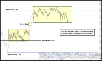
Price dances around the middle Multi-Pivot Line; it isn't making a great deal of progress above the line, yet it is unable to fill the Open Gap below the market, a sign of significant strength. It's a sloppy formation, yet if you look carefully at the last few bars on the chart, you can see that price tried to enter the Open Gap and failed; on the last bar of the chart, price Gapped Open higher and traded higher. Price trades as if there are significant Limit Buy orders at the top of the prior Open Gap.
- Are these Whale tracks?
- Does price action like this speak to you as clearly as if you could see the orders left by the larger players?
Price breaks out of the narrow range to the upside; then note it tries to trade lower back within the range but fails: Resistance has become support. The next day, price Gaps Open Much higher; price trades higher for two more days and then Gaps Open higher again. Note that price leaves these Gaps Open and trades higher, heading right for the middle Multi-Pivot Line.
- But what will price do when it gets there?
- Are there Limit Sell orders waiting or is the majority of the market caught short?
Click on the image to open the full size version!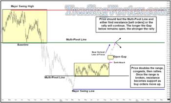
- Do you think price will head higher, breaking through the middle Multi-Pivot Line?
- Do you think mid-size and smaller traders got caught trying to sell this market in this sharp rally, expecting the Gaps to be filled?
- Do you think price will test the middle Multi-Pivot Line and then turn lower after finding a good deal of Limit Sell Entry orders and perhaps some Limit Sell orders left by the traders that were able to read price well enough at lower levels to get long for this quick ride higher?
Click on the image to open the full size version!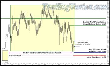
I am preparing to teach elementary and middle school gifted children across the country this upcoming school year how to use technical analysis to make money trading stocks, so I seem to be spending more and more of my time evaluating stock charts. And of course, I funded my son Sean with a small seed account after his wonderful performance in this same program last year [so I am watching his results with an actual financial interest!]. The prior charts in this series were prepared by me so you would have a perspective on this particular chart: Sean knocked on my trading room door after the market closed several weeks ago and told me he was going to put in orders to attempt a long position in this stock.
As has always been the case since I began teaching him, I didn't share my opinions about the actual potential trade; instead, I looked at his use of the trading tools he has been taught, especially the money management tools. I calculated the risk reward ratio and then internally pondered his logic behind the trade, as well as his areas for entering, stop loss orders and profit orders. I told him it was an interesting chart and made sure that if he had Limit Buy Entry orders in the market, he also had actual working Stop Loss orders in the market for protection, and he assured me he did; as with all traders I mentor, if I find they are trading without 'hard' Stop Loss orders in the market to limit their losses, I no longer work with them. Harsh as it sounds, if Sean violated this rule, I would close his account immediately and our 'working' relationship would be permanently ended.
Sean viewed the upper yellow area as a new Box Formation and he was impressed that price climbed from one Box Formation to another, leaving a large Open Gap on the way which was still unfilled; he particularly liked that traders tried to push price below the Box Formation in an attempt to fill the Open Gap but this down move was an immediate failure. In his opinion, Whales had left large Limit Buy Entry orders at or near the top of the Open Gap and he wanted to enter a long position if price headed lower to retest the recent lows.
Sean wanted to buy a retest just above the recent lows, at 53.60, with an initial Stop Loss order at 53.08. 'Where did he get his Stop Loss level?' He felt there would be large Limit Buy Entry orders at or near the top of the Open Gap. IF there were enough sellers to push price through to the middle of the gap [the High of the Open Gap is at 54.17 and the Low of the Open Gap is at 52.00, so the middle of the gap is (54.17 + 52.00) / 2 = 53.085], or if he was wrong and there were very few Limit Buy Entry orders and price made it to the middle of the Open Gap, he felt it likely they would at minimum fill the Open Gap to the downside - and this would be a significant Change in Behavior.
His Logical Profit Target would be just below the Multiple Highs clustered together, at 58.45.
He would be risking 52 cents on this trade to make a potential $5.37, which means his Risk Reward is 537 divided by 52, or just over ten to one: a nice Risk Reward Ratio by anyone's standard. The stop is small by his standards and the risk reward is very attractive. He liked the trade entry set up, so he entered his Limit Buy order and his Initial Stop Loss order.
Remember, he can't enter a Limit Sell order to take profits until he has a position, so that order will have to wait.
- What do YOU think about Sean's trade set up and the logic behind it?
- Do you see what he thinks are tracks left by Large Limit Buy Entry orders [Whale tracks]?
- Or do you see a clear break of the Boxy Formation to the downside?
Click on the image to open the full size version!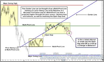
As I said earlier, I don't tell Sean or any of my students my opinion of their trade entry ideas; I personally find that when other traders dissect my trade entry idea on a potential trade with me, it changes the clarity or conviction I have of that particular trade, so I will check their money management and make sure they are using their trading tools correctly, but I wait to share my feelings about their trade idea until after the trade has either played out or been discarded because price never let them into the trade.
But I once I've seen Sean's trade entry idea, I am intrigued. To me, it isn't a strong enough reason to go long, at least as he presented the idea on his chart. But maybe he is seeing something he hasn't or can't communicate. For example, maybe his 'charting eyes' are good enough to 'see' the frequency of price, but he hasn't drawn that in [or perhaps he recognizes the frequency internally but isn't in the habit of drawing it in or doesn't have the tools to draw it in yet - Remember, I do not teach the elementary and middle school traders Action Reaction Lines and Median Lines.].
I begin to look carefully at his chart to see if there is a reason for price to run out of downside directional energy where Sean wants to enter his long trade.
- Besides the potential for large Limit Buy Entry orders at the top of the Open Gap, might there be a reason based on price's frequency for price to run out of directional energy here?
- Or is Sean simply leaning on potential Whale tracks and is willing to take the trade because it has a very small stop and a great Risk Reward Ratio?
I start by drawing in an up sloping Multi-Pivot Line, beginning at a Prior Swing Low that also formed the Baseline of a Mountain - and this Baseline would later become an important Multi-Pivot Line that mapped out the consolidation before price formed the current Open Gap and the Box Formation above it. This up sloping Multi-Pivot Line is also a Center Line; note how it catches the frequency of price in both of the Box Formations and how it cuts through the center of the Open Gap formations. This line seems to catch frequency - let's see if the frequency is found elsewhere on the chart.
Click on the image to open the full size version!
I add a parallel up sloping line that starts at the Swing High that forms the same Mountain. It's a nice parallel line, one I label an 'Action Line'.
- But will it have any meaning going forward in price and time?
- The question goes back to: 'As above, so below.' Will 'Equal and Opposite' have any meaning on this chart?
Click on the image to open the full size version!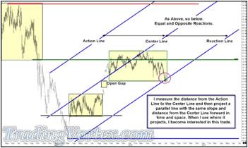
Now I measure the distance from the Action Line to the Center Line and project that same distance forward in space and time. To complete the projection of frequency from the up sloping Center Line, I add an up sloping parallel line, the Reaction Line, at this projected distance.
Now I do what I teach my younger traders to do when evaluating a chart: I slide my chair back a good three or four feet, close my eyes for a few moments to clear my head and take a clear look at the entire chart.
- I see the stacked Box Formations separated by the Open Gap and more,
- I see where the Reaction Line projects forward in price and time: right where traders just tried [and failed] to fill the Open Gap.
When I first glanced at Sean's chart, I wondered if price was simply going to rally slightly and then continue lower in a cascading formation. But this Reaction Line gave an excellent projection of where price should run out of downside directional energy: price turned right at the projection!
Now let me add Sean's Limit Entry, Exit and Initial Stop Loss orders to this Market Map:
Click on the image to open the full size version!
No, there's some noise present in this market, but remember these are daily bars, so this Gap has been Unfilled for almost a year! The distance between the Center Line and the Action or Reaction Line is a similar distance, so you have to expect some noise. But all in all, it's a very compelling chart and I am willing to lean on 'As above, so below' until the Gap is filled; after spending some time of my own drawing on Sean's chart, I like his entry set up, I love the size of the small stop, the Risk Reward Ratio and the chart does project the frequency of price nicely.
I add one other line: I connect the last three Swing Highs on the right hand side of the chart. Each is lower and price may have trouble climbing above this down sloping magenta trend line. Sean used a similar simple trend line to take partial profits in his first live trade, Burger King, and it turned out to be a gorgeous area to take profits. I wonder if he will see this same line [I won't show him because I want to see what he can 'see' and how he uses his trading tools].
Click on the image to open the full size version!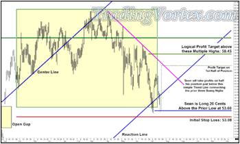
Nearly two weeks go by before Sean is filled on his open Limit Buy Order. Remember that because he will soon be in school all day long, I do not allow him to watch the markets during the day. He is allowed to check his orders and the day's price action for fifteen minutes at 4:30 pm Arizona time; he can then cancel and replace his orders, do charting homework and enter new orders if he finds a new trade entry set up he likes that fits his trading style and is within his trading rules.
I get a knock on my trading room door at about 4:35 that day - He's long and he's excited! I ask to see his trading plan and a printed chart of his new position [This is a requirement I make of all my students: If you want to talk about a position, you must bring your trading plan and a current chart showing your orders and your interpretation of the current Market Structure, whether it is an 'in person meeting' or a virtual mentoring session]. I'm not surprised to see Sean has added the magenta down sloping line connecting the prior three Swing Highs and will take profits on half his position if price gets there before stopping him out of his new long position.
Sean is excited price did not make a new low for the move; though I don't say anything to him, I notice that price closes near its lows on a wide range bar.
- Is this the resumption of the cascade lower?
- Or does Sean 'see' Whale tracks better than most traders?
I'll give him this: He is either entering this market at just the right time, when no one in their right mind [other than Whales] want to get long - and many mid to smaller traders are being stopped out of long positions from higher levels - OR he is entering right as price tips off a cliff and begins a free fall that fills a Gap that has been Unfilled for nearly a year.
But he has a plan, the stop is small compared to his maximum allowable stop and the Risk Reward Ratio on his original Profit Target, if he is not stopped out of this position, is well over ten to one! The Risk Reward Ratio on the first half of the position, selling half just before the down sloping magenta trend line that connects the prior three Swing Highs, is better than seven to one. He has a plan, he has a position, his Stop and Profit orders are in the market. Now he just has to manage his emotions and follow the plan.
Now the trading gets fun! Sean WAS buying when everyone else [but the Whales] were selling. When price opens higher and fails to make a new low, a multi-day rally begins and on the fourth day after he gets long, price gaps open higher and closes near its high, nearly filling the first half of his profit target at 57.39. When he checks his positions and orders at 4:30 that afternoon, he decides to cancel his Initial Stop Loss order and move it up to Break Even. He's now working a Limit Sell Order on one half his position at 57.35 and he's leaving his original Limit Sell order at 58.45 on the balance of his position.
Click on the image to open the full size version!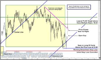
Watching him plan and execute his plan tells me a great deal about his ability to become a consistently profitable trader:
- Does he stick with his plan?
- Can he execute his plan and keep his emotions in check?
- This is currently a winning trade, and because he moved to Break Even, he won't lose money on the trade, but how will he react to a live losing trade, with real money?
- If he takes profits on this position and then prices explode much higher to the upside, how will he feel emotionally?
As I said in an earlier article, welcome to 'Mastering Yourself, son'.
Click on the image to open the full size version!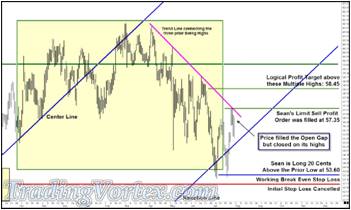
Sean's Limit Sell Profit order for 1/2 the position was filled the next day at 57.35, a few cents off the high of the day. Price began to sell off and managed to fill the Open Gap this past Friday as I write this, but note that after opening on its low and filling the Open Gap, price closed on its high. It will be interesting to see how price reacts IF it makes it back up to the magenta down sloping line, since it has now had 'Three Drives to the Top' along this Simple Trend Line.
As I write this and move my chair back three feet, close my eyes and relax, then open them and take in the entire chart, I believe Sean's original 'take' on this chart was correct:
- Price climbed out of a Box Formation,
- Left an Unfilled Gap [which is still open nearly a year later!]
- And is now creating a new Box Formation.
He read the Whale tracks correctly, there certainly seems to be some significant Limit Buy Entry orders at or near the top of the Open Gap. And I believe he had enough profit in the position that he had to move his Initial Stop Loss order to a Break Even Stop order.
- Where will price go from here?
- Will the Whales still have Limit Buy Orders in the market if price sells off and approaches the top of the Open Gap again?
- Will the magenta trend line contain the rise of price if it climbs back to test it again?
I hope you found this article interesting and informative. It's a new experience for me to be an investor and of course, to watch my own young son plan and execute live trades in the markets; I catch myself biting my tongue at least once during each conversation, because I have promised myself I would not give him my advice, and looking at his results, he hasn't needed my advice so far!
Reading Gaps in Charts to Find Good Trades:
One of the most rewarding and challenging things I have done in my forty year trading career is teach elementary school students the basics of technical analysis and how to apply those basics to make money trading stocks. Each student comes to the trading class with a fairly clean slate: They don't know much, if anything, about the markets and they don't carry any of the emotional burdens of having to make 'real' money to pay the rent or buy food. They soak up what I am willing to teach - which is a delight! But once they soak it up, they roll it around in their head and then ask some of the most thought provoking questions!
When starting with an unmarked chart of a stock, I often point out market structure: Swing Highs and Lows, Ranges, Double or Triple Tops or Bottoms, and Gaps. On one particular afternoon, I started with a chart and began marking out simple Market Structure and after a few minutes, the questions began:
- Why did I place any significance when price gapped higher or lower?
- Did it matter if the gaps remained unfilled or were all gaps the same?
- If gaps are important, how can you use them to make money?
This is the chart I started with:
Click on the image to open the full size version!
Then I began to draw in what I considered to be the significant Market Structure, the 'Don't Miss These things' that each of them should see when they first examine an unmarked bar chart.
Click on the image to open the full size version!
On the unmarked chart, the first Market Structure that caught my eye was the Unfilled Gap that price left right as the down turn began in earnest, and of course, I may have noticed it first because we generally look 'left to right'.
Click on the image to open the full size version!
Once the Unfilled Gap out, I added another easily spotted structure, 'Three Drives to the Top', and these were particularly easy to spot because each top was lower than the prior top. Once I marked the 'Three Drives to the Top' formation, its twin formation became evident:
Click on the image to open the full size version!
This particular set of 'Three Drives to the Top' and 'Three Drives to the Bottom' are generally very reliable, because the tops are forming lower and lower highs and the bottoms were forming a flat base. One of two outcomes flow from this set and the resulting move is generally explosive:
- Either a fourth Drive to the Top breaks above the prior three highs [and remember, each of the three are Swing Highs, so a break above this formation should indicate a change in behavior]
- Or the third drive lower fails to hold at the test of the flat base [or a minor rally following the third drive runs through the flat base]. While forming this flat base, price has been restoring energy and when the bottom is violated, it generally moves a good amount to the downside.
Let's look at the interplay of the Market Structure I have marked so far:
Click on the image to open the full size version!
When I view these formations, I like to take them apart in my mind and think in terms of the Physics behind the Market Structure - which is how one of my earliest mentors, Dr. Alan Andrews, taught me to think about the markets.
The Unfilled Gap, right at the beginning of this chart [and if you are like me, you view this entire chart as a whole], is like the winding of a spring in a clock; the Unfilled Gap shows you this market is rested and ready to move and it also gives you the direction, as clearly as the hands of a clock moving in one direction.
To flesh out the analogy, the three attempts price makes to rally are like the swinging of the pendulum in an old fashioned clock - and each time the pendulum swings back within a confined space or range, it's as if the clock spring is being rewound tighter and tighter. When price breaks below the flat base on the third drive lower, the pent up energy is expended quickly and in one direction: down!
Is there anything else we can learn from Physics about this chart before we move on?
Click on the image to open the full size version!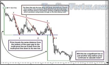
Let's examine this chart and keep in mind the analogy of price being a large clock, with a wound spring driving price's movements.
- First, I measure where the wound spring of the clock was originally released and measure how far it powered price lower before it slowed and then restored its energy: in this case by trading within a tightening range that was marked with a flat bottom.
- Then I project that same distance from the area where the newly rewound spring was released [where price broke below the flat bottom of its trading range].
As a student of Physics, it is not surprising to me when the lengths of the two distances are very nearly the same; in this case, price runs out of downside directional energy at almost exactly the same distance.
Now I am focused on the lowest low on the chart and the bars that follow it; specifically, I am looking at the very last bar, which is a wide range bar.
- Does this bar have any significance?
- Or is this bar just a wide range bar in a cascading downtrend?
Let's look at it closer:
Click on the image to open the full size version!
I zoomed in so you could see the bars after the lowest low much more clearly; my eyes are drawn to the very last bar on the chart. Price had begun to climb out of the hole after meeting its projected low and had a nice little rally going - It may even have broken above a minor Swing High or two. And then something - News, a very large sell order, an overall breakdown of the prices in the stock market - made price open up much lower than the close of the prior day. But even though it gapped open much lower, it found nothing but buyers at the lower levels.
How do I know there were buyers at the lower levels?
Price closed near its high, in fact, it closed higher than it did the prior day. There is a trading term that was started in the currency markets in the mid - 1980's: When this type of action was seen, large knowledgeable traders would say that there were 'Whales feeding there!' In this case, when price gapped open much lower, the average retail trader either sold out or was stopped out of their long position; or worse, they may have even gone short when price gapped open, expecting the prior low to be broken.
But a few large traders, the Whales, bought all the shares being dumped and then began to buy more, pushing prices higher; soon, those traders that had gone short on the lower opening were buying, covering their losing short positions. And at some point, the retail traders that had been long but had dumped their long positions began to realize price wasn't going lower, not today at least, and they also began buying, establishing new long positions at higher prices. And so the gap was filled and price closed higher on the day, quite a remarkable recovery!
But does one bar like this mean the sell off is finished?
Of course not. Price action must be observed carefully from these levels. Price will tell us when the downtrend is over: If we continue to see buying activity, there will come a point where a change in behavior is obvious. This particular bar is interesting because of the failure of the large gap lower to hold, but at the moment, it is just something interesting to file away in the back of your mind as you watch price unfold from this point.
Let's watch price unfold a bit and see what we notice:
Click on the image to open the full size version!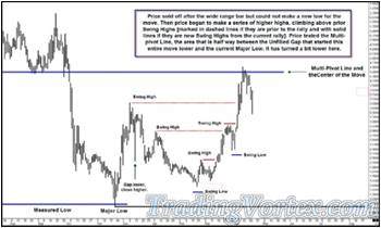
First, let's find that wide range bar that gapped lower but closed higher and you can see I marked it on this chart. You can see that bar did not signal price was about to sky rocket higher; instead, it was indeed something to file away in the back of your mind: 'There were Whales or large traders willing to buy this stock as it traded towards it prior low'.
Depending on the length of your holding period and how much risk you are willing to expose your account, you can do different things with this information:
- If you are a long-term investor looking to add long term positions to your portfolio, there may be a price down near the prior low where you are willing to buy some this stock [it is a major company and has a very large daily volume, by the way], with a stop loss 30 to 50 cents below the prior low.
- If you are a trader that uses daily bars when trading stocks and has a holding period of days or a few weeks, you may be willing to watch price action before deciding where this stock is heading; you may be willing to trade time and price to get more information before you make a trading decision. Since I am a trader, not an investor, I am always willing to make this trade off.
So I watched patiently. As it traded lower from the wide range bar that gapped lower and closed higher and headed towards the prior lows, I had no sign from price that a change in behavior had occurred. I was willing to watch as price declined to see if the Whales were still buying at lower levels, and to get me interested in getting long this stock, I would need to see some signs of strength.
Price traded lower but was unable to approach its prior low. Then price began to stair step higher. As I watched patiently, I began marking Swing Highs and Swing Lows. Price eventually climbed above two Swing Highs that I had marked from the prior move lower [marked in dashed red lines], a measurement I generally use to tell me to pay attention, a change in behavior may in the making.
But let's go back to the clock spring analogy again:
Price HAS climbed higher and it HAS taken out two prior Swing Highs. But it stopped right where the clock spring should have run out of directional energy IF price was still vibrating with the same frequency; price has now retraced fifty percent of its sell off, the amount of potential energy price found each time in the clock spring on the way down.
- To get me interested in buying this stock, I need a sign of strength, I need to know there are buyers at higher levels.
- Or perhaps I will be a seller as price retests the fifty percent retracement area.
- Or perhaps I will continue to wait.
My actions at this point will depend on what price shows me next.
Click on the image to open the full size version!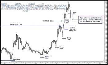
Price rallied even further, breaking above the half way point marked by the blue Multi-Pivot Line. It also left several Unfilled Gaps on the way up. Now price may have topped out. It has broken below several Swing Lows made during this current rally. A sign that generally make me pay attention in case a change in behavior has taken place.
But look carefully at the last bar on this chart: price has sold off below two prior Swing Lows, and these are signs of weakness. But it tried to enter and fill an Unfilled Gap but it failed to fill the gap. It gapped lower, inside the Unfilled Gap, but closed near its highs. This is a sign of strength.
Is this a sign Whales are interested in buying at these higher levels?
In my mind, the next bar should give me key information:
- If price turns lower and fills the currently Unfilled Gap, price is likely headed lower.
- If price heads higher, leaving this Gap Unfilled, it is a sign of strength, a sign the Whales missed this move higher [I certainly chose to sit on the sidelines while this stock rallied quite a bit!] and have an interest to buy at this Unfilled Gap.
- If price trades quietly for a bar or two, which is always possible, I'll simply wait for price to show its hand. I believe price is now at a level where the next move will give me a clear direction.
Click on the image to open the full size version!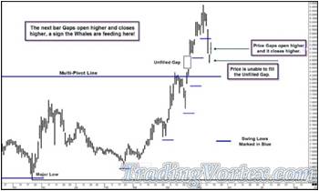
Price gives me an indication that the Whales have left limit buy entry orders at the Unfilled Gap area. I cannot overstate how much of an edge you have as a trader when you have the ability to read where the large buy or sell orders are sitting in the market by the price action on a simple bar chart. I learned this ability because I was one of the five or six cash Forex traders that spawned the original term 'Whales' in the mid-1980's. It was easy for me to see my own 'tracks' on a bar chart, because I knew what orders I was working in the market and how these orders showed up in the price action. And I quickly learned what the 'tracks' of the other 'Whales' looked like that traded in my active time zone; eventually, the similarities of the Whale Tracks became apparent, and it became second nature to me to be able to see these signs on a bar chart.
Click on the image to open the full size version!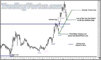
I add a simple trend line drawn from the low of the prior Swing Low below the Multi-Pivot Line and connect it to the low of the bar that failed to fill the Unfilled Gap: where the Whales have left large limit buy orders.
Are there other things to consider?
Click on the image to open the full size version!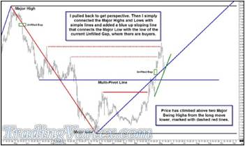
I pull back for perspective and simply connect the Major Highs and Lows with simple lines; I add a blue up sloping line connecting the Major low and the low of the Unfilled Gap, where I know the Whales have left limit buy entry orders.
Price has broken above two Major Swing Highs from the long move lower, a sign a change in behavior may have occurred; although I have mentioned this several times at various places, this is the first time price action has confirmed this potential change in behavior. Now that both price and Market Structure have given me what I was looking for.
Let me show you my orders:
Click on the image to open the full size version!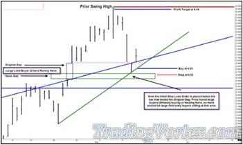
I want to buy a retest of the up sloping green simple trend line, at 4.83; my initial stop loss order will be at 4.53 and if my limit buy order is filled, my profit target will be just below the last Swing High, at 6.48.
Note that I placed my stop loss order below the low of the bar that failed to fill the Unfilled Gap, where I know Whales have left large limit entry buy orders: if price begins to run through their orders or if they pull their orders and the gap gets filled, I no longer have the Market Structure in place that spawned this trade idea.
Click on the image to open the full size version!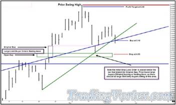
Sometimes, you must be patient and diligent and stick with your plan until price decides to let your limit orders get filled. As each bar closed [especially because these are daily bars] I move my cursor to see where price will intersect with the green up sloping line. In this case, I got filled on the fifth bar. Because I am trading against an up sloping line and the intersection price climbs higher with the close of each bar, there is a price where the risk reward has eroded too much or the initial stop loss has gotten too large for me to continue to work the orders associated with this trading idea.
After moving my order higher four times, I am risking 63 cents to make a potential $1.32, which gives me a risk reward of just over two to one. I rarely take trades with risk rewards under two to one, so if I had not gotten filled on this bar, I probably would have pulled the order. I also like my retests to be between three and five bars after the initial test; once it takes more than five or six bars, I will generally pull my orders and watch price again, waiting for another clear sign that there are buyers or sellers in the market.
But I do get filled on the fifth bar at $5.16. I immediately check to make sure my initial stop loss is in the market and then I enter my limit sell order [my profit order] at $6.48. Then I check again to make sure I bought the amount of shares I wanted to buy, at the price I wanted to buy them - now is the time to find any problems, not after price has moved far away from this level. Once I am sure I have the position I want to have, at the price I expected, I double check the orders I am working in the market. Now I have to watch price and execute the plan I made before entering the position.
Click on the image to open the full size version!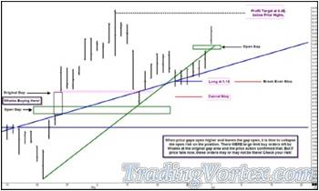
Once I am long at $5.16, the next several bars are uneventful; then price begins to creep higher. When price gaps open higher and closes quite a bit higher, I cancel my initial stop and enter a Break Even stop loss order. Remember, the original risk reward on this trade was barely acceptable to me, so this unfilled gap gives me an opportunity to 'collapse my risk'. If price is not heading higher from here after leaving another higher Unfilled Gap, I don't want to lose money on this trade.
Click on the image to open the full size version!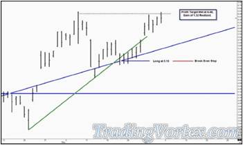
Once I moved my Initial Stop Loss Order to a Break Even Stop Loss Order, price made an orderly climb higher and my limit sell order was filled at $6.48 four bars later, giving me a net profit before brokerage of $1.32.
You can see the Unfilled Gaps played a major part in my though process and decision making. Many traders don't understand the significance of gaps and this article has just scratched the surface of their meaning and how to use them to your advantage. But understanding and using Unfilled Gaps as I have in this example is something you can practice and ultimately add to your trading tool kit.
The Ultimate Risk Management Tool: Equivalent Risk.
I was asked earlier this year by several elementary schools to teach the basic of trading to their gifted students; one of the students happened to be my eleven year old son, Sean. The students competed in a national stock trading contest that ran from mid-January through late April. The students could only be long stocks and each school had a team [since these were only the extremely gifted students at each school, the groups were small: 3 or 4 students per team on average]. I taught them a simple charting methodology [I called it Crayon Drawing, because it was based on market structure and simple lines (No indicators were used) though the use of strict money management was featured prominently each time we met. I refused to give them trade ideas, nor would I tell them where and when to get out, profit or loss; I would point them, using questions, to a line of reasoning that would allow them to find the answers they needed themselves. I am proud to say that three groups I helped all finished in the top ten in the country; the two in Illinois finished third and fifth [The school system in Arizona, where I now live, has not yet given me permission to release any information more specific - the Arizona team finished in the top ten as well].
My first impression?
We should have ten and eleven year old manage our retirement money! The three groups averaged a 12.4 percent non-annualized increase in the value of their trading account over that short period of time, using no leverage and only being able to be long stocks. They set their maximum risk to no more than twenty percent of their account on open positions - though they never approached this level of risk. One of the main tenets in my own trading and one of the things I insist on when I mentor other professionals is that stops are always in place, the moment a position is put on as well as logical profit targets. I taught this to the students and the practiced it religiously.
What made these students take to trading so quickly and seemingly easily?
My slogan is 'Master your tools, Master Yourself'. I believe mastering yourself and your emotions about positions and money [greed and fear, the 'need' to make money] is the most difficult part of trading. I try to build simple tools to help take these emotions out of most trader's minds, but at this young age, though the students are truly enthusiastic, they are generally not burdened by these emotions: They have no house payments and all the other burdens so many adults have when they first begin to learn to trade. These young adults also have a 'clean slate'; they have not been bombarded with the unrealistic and even fraudulent claims so many vendors use when trying to sell their trading books, courses, software. To these students, this is just another skill, like long hand division or expository writing they have to master - though I dare say the students I helped seemed a bit more enthusiastic about learning to trade than learning long hand division!
My son really enjoyed the experience. Those of you that follow my writings here at MoneyShow and the presentations I give at Traders Expo know that Sean has been helping me update my had drawn charts for several years and made spotted several incredible opportunities that I managed for him [his sharp eyes and charting abilities led to a nice short crude oil position just above $146 a barrel and a nice long position at $35 a barrel]; it's safe to say his college fund his college fund is ready to go!
As soon as school was out this year, I got an unexpected request from him: He asked me when I started to learn about trading. Regular readers here or people that follow my writings on my web pages know that I was extremely lucky to have an older brother that loved to speculate in the commodities market. His interest in trading and a family friend that owned a large scrap yard in Chicago and traded to hedge his cash metals holdings led to me learning about charting and trading at Sean's age.
Once I repeated the story to Sean, he immediately asked me if he could trade an account, like I did when I was his age. To be honest, I felt I owed him the same opportunity my brother gave me, so I offered him this opportunity:
- He will trade a simulated account for a minimum of six months, though the depending on the results and how his ability to master essential skills, the trial may go longer.
- He may pass, he may fail. As I tell all my students, the profession 'trader' is not stamped on your birth certificate. The key, in my opinion, is whether he can master himself.
- IF he passes the simulated account successfully, I will fund a small trading account, with a $2,000 maximum stop out on the entire account, which is exactly how my brother started me out in commodities.
He's in the middle of his first simulated trade, and he came rushing into my office during one of my live Mid-Day Mentoring sessions to tell me he got filled on his entry, so several hundred people are now watching the results of his trade live, as he moves the stop orders closer; he is nicely profitable in this first trade and about to enter his first stop profit order today after the market closes.
But besides successful simulated trading, he has to learn and master what I consider to be important tools that will give him an edge in the marketplace. For example, over the weekend, we were updating weekly commodity futures charts and cash Forex charts. Of course, I never saw the question coming: 'Dad, can I trade futures and Forex in my simulated account?' I thought about limiting him to stocks but I teach everyone that the repeatable patterns you should be looking for and researching come in all markets and in all time frames. Since he is in middle school, I wouldn't let him focus on short-term trading, but I decided not to limit him to just stocks.
That opened a whole new set of tools and techniques for him to learn - but I like teaching and I have all the tools pre-built for my own trading. If he was going to trade stocks, futures and Forex, one of the first things I needed him to learn was the concept of equivalent risk; even if he only traded stocks, this is a very important concept that very few traders understand or utilize. Let's dig into this topic, using some simplified examples I put together for people that have only a basic understanding of spreadsheets [Like most people, I use Microsoft Excel].
Many retail traders trade in 'blocks', meaning that they always buy 100 or 1000 or 10,000 shares of whatever they are trading; if it goes up, they made money, if it goes down, they lost money. But is always trading the same amount of shares exposing their account to the same risk each time they take a trade?
Maybe a simple image will make the flaw easy to spot:
Click on the image to open the full size version!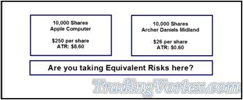
This trader always buys or sells 10,000 shares of whatever he is interested in, regardless of price or the volatility of the stock. This trader IS trading the same number of shares each time he trades, but he IS NOT exposing his capital to equivalent risk.
The first thing that jumps out at most people when I say the trader IS NOT exposing his account to equivalent risk is the difference in price between the two stocks:
- 10,000 shares of Apple was worth about $2.5 million US Dollars when this was written;
- 10,000 shares of Archer Daniels Midland was worth about $260,000 US Dollars.
The trader would obviously have much more capital invested in 10,000 shares of Apple compared to 10,000 shares of ADM. But that's easily fixed, right?
What if the trader simply did the math so he invested in an equal 'face value' of each stock? Let's take a look:
Click on the image to open the full size version!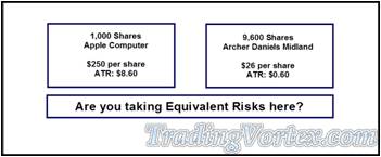
Let's do the math:
- 1,000 shares of Apple was worth about $250,000;
- 9,600 shares of ADM was worth about $249,600.
Now that the trader is initially investing a similar amount of money in each stock, is he exposing his account to equivalent risk?
There are many ways to measure volatility; none are perfect and some are extremely complicated. For this exercise, I used a very rough measurement of the Average True Range: which is an average of the daily high minus the daily low, adjusted for market gaps. This measurement is available on all charting packages and although is a very basic measurement, it's a starting point [I do not use the ATR in my own position sizing and money management calculations, but as I said, none of these measurements are perfect and this exercise is meant as a starting point].
It's easy to compare the volatility of these two stocks, simply take the average true range and divide it by the price of the stock. By this measurement:
- Apple has an ATR volatility measurement of 0.0344;
- ADM has an ATR volatility measurement of 0.0230.
If you've seen charts of these two stocks, it shouldn't surprise you that Apple is a more volatile stock. But adjusting just the amount of cash you invest in each stock so that you have invested an equal amount of cash doesn't reflect the differences in the volatility of the two stocks.
And if we add instruments like Exchange Traded Funds [ETFs] and Futures and Cash Forex to the things we might trade, the volatility becomes extremely important, though most retail traders don't understand they are not accounting for the different volatility of the instruments they trade, nor do they change their position sizes according to the volatility.
Let's look at a series of simple Excel spreadsheet examples:
That will show you how to get started measuring the volatility of the instruments you are trading and how to compare them, and then enter into positions that expose your account to 'similar' if not equivalent risk.
Click on the image to open the full size version!
Let's start out with an Excel spreadsheet and a handful of popular instruments:
- Apple Computer [a stock],
- GLD [The ETF for Gold],
- SPY [basically a closed-end mutual fund that allows you to buy and sell the stocks that make up the S&P 500 Index in one simple trade: it preceded the ETFs of today but functions about the same way],
- The CME E Mini 500 S&P Futures [the most popular stock index future traded in the United States, it basically mirrors the cash S&P 500 Index],
- The Comex Gold Futures [the most popular futures contract based on the price of cash Gold listed on a United States Exchange].
Let's take this diverse list of instruments and examine different ways we might try to get to the point where we are exposing our account to similar if not equivalent risk when we take a position in any of these instruments. Let me re-state the idea: When we take a trade in Apple computer, we want to expose our capital to the same amount of risk when we take a position in Gold futures several days later.
Click on the image to open the full size version!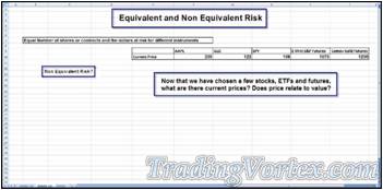
We've already discussed this and the obvious conclusion is that the price of the instrument does not necessarily relate to its value, especially when comparing it to other instruments.
Let's keep building our spreadsheet:
Click on the image to open the full size version!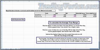
Now we add our first measure of the volatility of each of the instruments we are going to compare. There are many ways to measure volatility and many ways to use these different measurements. For example, a very short-term trader may not be interested in knowing that there are occasionally 'out of character' spikes in price in the instrument he or she trades every five or ten years on weekly bars because they are focused on five minute bars [These events are called 'Black Swan' events and although most people believe these events occur about once every 100 years, the measurements simply predict that in the case of normally distributed data, roughly 1 in 22 observations will differ by twice the standard deviation or more from the mean, and 1 in 370 will deviate by three times the standard deviation. They are of much greater interest to portfolio managers or traders that hold positions over long periods of time. I use a longer term approach to calculating my measurement of risk and volatility, so I do take into consideration these 'third deviation' moves].
But for this exercise, using a 20 period average true range is a good start for our volatility measurement of each vehicle. Begin with this measurement and you can always choose to replace it after you work with it for some time and learn about other methods and their strengths and weaknesses.
Click on the image to open the full size version!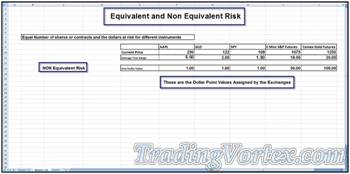
To do any calculations, we'll need to know both the current price of the instruments but also, the value of one dollar in a stock [of course, one dollar in the United States is worth one Dollar] or one point when trading futures [one point refers to a move from 1075.00 to 1076.00 in the E Mini S&P futures; it refers to the move from 1250.00 to 1251.00 in the Gold Futures]. These values are assigned by the exchanges.
Click on the image to open the full size version!
I NEVER trade without entering an initial stop loss order into the market at the same time I enter my entry order; I want my capital protected at all times. I have a maximum size stop loss I use based on my research of the a combination of the volatility of the instrument, as well as how far each instrument can trade past market structure roughly 80 percent of the time and still return to the major trend. Some people feel this is a redundant measure of volatility, but it is a number that relates to my own willingness to risk a certain maximum amount of capital for each instrument, based on its trading characteristics, do not confuse this with the average true range, for instance. I add the size and value of my maximum stop loss for each instrument I trade so I can compare what I am risking.
Click on the image to open the full size version!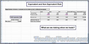
Now let's start building the calculations that will allow us to compare risk! I'll begin by assuming we are trading 10,000 shares of stock each time we make a trade or 10,000 futures contract.
Let's see how that works out numerically:
Click on the image to open the full size version!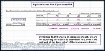
Just glancing quickly at the row marked 'Dollar Risk on Position' should be an eye opener for those of you that always trade the same number of shares each time you trade different stocks or trade the same number of futures each time you trade different futures.
These risks are not equivalent and it gets even more striking if we compare the risk associated with taking a position of 10,000 shares of Apple stock and 10,000 E Mini S&P futures: You'd be risking $86,000 on the Apple position and $9,000,000 on the E Mini S&P futures position. That's an incredible difference in risk!
I'm not suggesting the majority of traders or even a few traders are out there trading 10,000 shares of Apple stock and making the assumption that they are taking the same risk when trading 10,000 E Mini S&P futures. But I am suggesting that the majority of traders have not done an exercise like this and really don't have any idea how the risk on each instrument they trade compares. And it is something each trader needs to know if they trade multiple instruments.
Click on the image to open the full size version!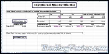
So let's build a new set of calculations and see if we can come with something that approaches 'Equal Risk' for each instrument we trade, each time we take a position.
Click on the image to open the full size version!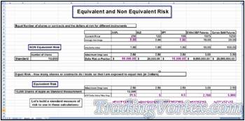
Are there other ways to measure the risk of an instrument? Yes. This is meant as a beginning example and is actually quite useful, as simplistic as it is, but feel free to explore and use other measures of risk or volatility.
Now let's build a table around this standard risk measurement:
see if we can work our way to actual equivalent risks across these instruments.
Click on the image to open the full size version!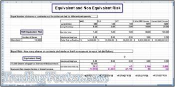
By using the standard risk measurement, we are now able to use a simple formulae to come up with similar or 'equivalent risks' when taking positions in any of these instruments. This table assumes that the standard position used to determine the position size in any of the other instruments is based on 10,000 shares of Apple, but you could easily change the number of shares or even change the standard from apple computer to any instrument [for example, I use U.S. 30 Day Treasury Bills as my 'standard unit' and compare the riskiness of all other instruments to 30 Day T-Bills].
I hope you find this exercise interesting. Many of you may have never thought of looking at your position sizes using this type of tool. Give it a try!
Improving Your Skills at Predicting Market Behavior:
I recently spoke at the New York Traders Expo and on the flight home, I watched one of those crime lab shows [I think it was called CSI Peoria…]. You know the shows I mean: the lab people are called in because there are no clues and they find a single skin cell on a gum wrapper. Once they analyze that single cell using their new super computer and its special software, the name of the criminal magically appears and the case is instantly solved. That’s the world we live in, right? High powered computers running super smart software can make all our decisions simple and flawless. We are surrounded by this message and pretty soon, we believe it in our hearts and minds.
When I give webcasts or speak at live seminars, the most often asked questions are: What software do I use for charting and what special indicators do I use to tell me where the market is going? I do my best to answer everyone’s questions: I still do my long term charts by hand drawing them; when I use computer charting programs, I use a variety of charting packages because I mentor and write and people like to see my analysis on the charting programs they use.
I don’t use computer generated indicators to tell me where the market is headed. I never use lagging indicators and when I use leading indicators [Median Lines, Geometric projections and retracements and simple trend lines], I use them to ‘frame’ price structure. Then I use my mind to sort through the various possibilities, to get a clear likely path of price. Once I have the likely path of price in my mind, I look to the market to tell me where it is going. The market is always right, so I always trade what it is showing me. Computers, computer generated indicators and computer software always tell us what we program them to tell us, so if conditions change or if the premise is incorrect, the computer will give us a meaningless answer. The market is going where it is going, so I spend the majority of my time watching market structure to determine where the market is going.
I want to show you some of my thoughts about a particular market. But to keep your mind open and clear and without opinions, I’m going to show you my work on charts that do not name the instrument, do not give a timeframe, do not give a price scale, in short, I have taken out all the clues from these charts that will tell you what market you are looking at. If you don’t know these things, maybe it will be much easier for you to see what clues I am looking at and why I think each of the market structures I am looking at are so important.
Let’s give it a try, shall we?
Click on the image to open the full size version!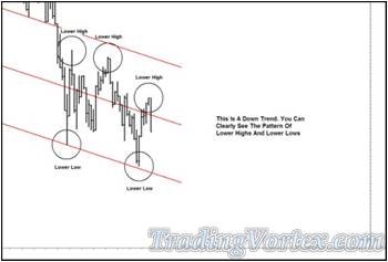
This market is clearly in a down trend. If you look closely at the upper left portion of the chart, you can see it was in a strong down trend before it made the current series of lower highs and lower lows.
You can see I have a red down sloping Median Line set on this chart and it’s doing a good job showing me where price should run out of down side directional energy. Price is heading lower and this leading indicator has marked the probable path of price for me.
Price is trading right in the middle of the current down sloping trading range. Price has just left a lower high and I have no indication that this pattern of lower highs and lower lows is likely to be broken.
Click on the image to open the full size version!
Then, price breaks above a single minor swing high. To ponder the probable path of price, I make a fresh chart and add a blue up sloping Median Line and its Parallel Lines. You can clearly see price has left triple bottoms below where it is currently trading.
Click on the image to open the full size version!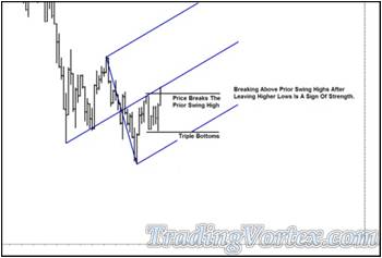
It’s important for me to emphasize that this chart covers the same market action as the prior chart, although five bars have now gone by.
If I completely forget the first chart, it is quite easy for me to ignore the series of lower highs and lower lows that are on this chart. By simply replacing the red down sloping lines with blue up sloping lines and marking the break above a single minor swing high, I have completely changed the ‘psychology’ of this chart. If I step back and compare the two:
- The red chart makes me feel ‘bearish’ and,
- The blue chart makes me feel ‘bullish’.
If I show these two charts to one thousand traders, a good ninety percent of them will switch from being bearish to bullish when I replace the red down sloping lines with the blue up sloping lines, especially after pointing out that price just broke above a minor swing high.
Why do these minor changes on the same chart alter their opinion?
Let me show you these two charts of the same action ‘side by side’ so you can see that by bringing your opinion to any chart can completely change what you draw, feel and see:
Click on the image to open the full size version!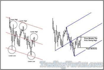
It almost hurts your eyes to try to ‘see’ the same visual cues on both charts: that’s how powerful the slope and color of the lines can be! Humans are visual in nature and we see what we want to see, so it is vitally important to do our analysis with as clean and clear a mind as possible.
Now let’s go back to looking at the charts one at a time:
Click on the image to open the full size version!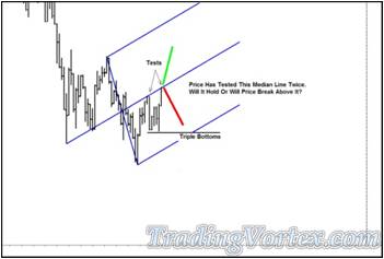
Price has tested the blue up sloping Median Line twice. It has also left triple bottoms that will act as support below where it is currently trading.
- Where is price headed?
- Is the probable path of price higher from here?
- Is the probable path of price lower from here?
Click on the image to open the full size version!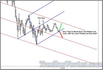
Price was unable to break above the blue up sloping Median Line and after consolidating, it traded lower.
To make it easier for you to see both the up side and down side potential of this market, I added back in the red down sloping lines and left the blue up sloping lines as well.
Price is testing the blue up sloping Lower Median Line Parallel. You can see by the two tests of the blue up sloping Median Line that this line has shown us where price should run out of directional energy.
- Will price stop now at the blue up sloping Lower Median Line and turn back higher?
- Or will it break through the blue Lower Parallel and trade lower?
Price had no trouble breaking below the blue up sloping Lower Median Line; in fact, every rally seems to be met with fresh sellers. Thirty bars later, price has broken below the prior major swing low and shows no sign of climbing back above it.
Click on the image to open the full size version!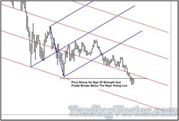
- What is the probable path of price?
- Is price more likely to head higher or lower?
Click on the image to open the full size version!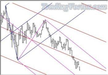
Price accelerates to the down side. This is a very weak market.
- What is the probable path of price going forward?
- Have you guessed what market I am charting for you yet?
Many of you have probably guessed: this was a series of daily bars of the Dow Jones Industrials Index. This last chart shows the action through Friday, February 27, 2009. You can see I marked what I consider to be the probable path of price with a set of thick green lines.
Click on the image to open the full size version!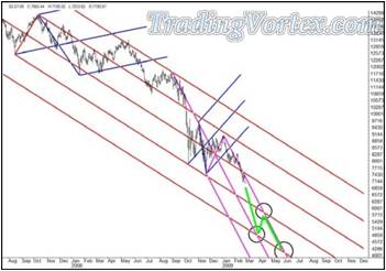
When I speak of the Dow falling to 5500, I can see the fear and shock in people’s eyes. At a recorded interview at the November 2007 Traders Expo, with the Dow right at the 13,000 area, I told Tim Bourquin of the Money Show Network that my charts showed the Dow would likely break 7,500 within eighteen months; fifteen months later, we are closing just above the psychological 7,000 level on the Dow.
I know what I see in the charts I have presented here. I think it would be best for this country and the world economy for all of our worst fears to be realized quickly: The governments of the world should stop throwing good money after bad and let the Dow and other major indices fall until they find a sustainable level. And then I believe the stock markets around the world would begin a period of range trading, while investors slowly began examining stocks around the world for some signs of stability and then for stocks that might be undervalued. This purging process is necessary, and once it happens, once our worst fears are realized, the healing and rebuilding can begin.
How To “See” The True Message of the Markets?
People ‘see’ things all the time. We ‘see’ a face on the shadowy pockmarked surface of the moon. We ‘see’ horses and dragons and fairies when we look at the fluffy clouds in the summer sky and we ‘see’ crabs and horses and bulls when we look at the pinpricks of light standing out from the pitch black night sky. The problem with ‘seeing’ things is that we may be projecting what we want to ‘see’ instead of what’s really there.
Because I deal mainly with technical analysis of the markets, it is important that I do not project my feelings and opinions onto what I ‘see’ when doing analysis, though that’s often a difficult task. There is real value in the results of objective technical analysis, but there can be great danger if a trader ‘sees’ what they want to see in their technical analysis.
When I teach traders to be better traders in my mentoring programs, one of the things we work on over and over is keeping objectivity in our analysis. I find this is best accomplished by always using a set of tools that you have mastered and know inside out. And to keep emotions out of the analysis and trading, I find it’s best to develop a step-by-step approach. You’ve heard of ‘paint by the numbers’? I try to help each of my students develop their own ‘trade by the numbers’ routine, one that plays to their own strengths and avoids their weaknesses.
By laying out a detailed step-by-step trade plan in writing, before the trade begins, each trader has a ‘Market Map’ in front of them, and if their emotions start to creep in or if they lose their focus, they can easily get back ‘in step’ with their original trade plan, because they have it right in front of themselves on their desk.
The hardest part of any trading plan is keeping your head free from emotions and opinions until all the pre-trade analysis and planning is finished. Think about it: If you begin with an opinion and you are like most of us, you are much more likely to pay attention to the analysis that supports your pre-trade opinion. But opinion-free analysis is a learned habit, so I often spend a good deal of time with traders that are new to the mentoring process going over their analysis while they are still ‘stalking’ a trade.
Let me show you just what I mean:
Click on the image to open the full size version!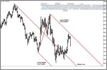
Here is a chart of the daily Gold Futures from one of my newer students. You can see that he added a red down sloping Median Line to show what he feels is the ‘most probable’ path of price. If he is correct, price should run out of upside directional energy at the red down sloping Upper Median Line Parallel, and that would be an area where he might look for a high probability trade entry set up to enter a short position in the Gold Futures.
Let’s look at the second chart he presented me as part of his ‘pre-trade’ analysis:
Click on the image to open the full size version!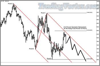
Before drawing in what he considered the likely path price would take, he took the high at Pivot C and the Low at Pivot D and then calculated the 61.8 Percent Geometric Retracement [what many traders call the 61.8 Percent Fibonacci Ratio].
What actually happened?
Many traders feel that ‘Fib Ratios’ offer them clues about whether a move higher in an established down trend, for instance, is a pullback in a down trend or whether the move higher is a change in trend to the up side. In particular, some traders view the 61.8 Percent Fib Ratio as the dividing line: if price has been in a down trend and then manages to rally past the 61.8 Percent Fib Ratio, it’s likely the move higher is a new emerging up trend, not a rally in an established down trend. And you can see on the chart above that this trader was pointing to price’s failure to test or break above the 61.8 Percent Fib Ratio before turning back lower as a likely sign that the recent up move was merely a counter trend rally.
The new student then added what he considered to be the most probable path of price. After doing his pre-trade analysis, he had decided price was about to resume the down trend. With this view in hand, he would be looking for price to test the red down sloping Upper Median Line Parallel after a slight rally, note that he expected the next rally, the one that might test the Upper Parallel, would be lower than the prior swing high.
When I work on pre-trade analysis with a trader in mentoring, I am examining the trader’s analysis and ability to ‘read’ or ‘see’ the market structure clearly. In my mind, I am asking:
- Can the trader ‘see’ the market structure clearly?
- Has he considered both the down side and up side scenarios during his pre-trade analysis?
- Is he projecting a realistic probable path of price?
- Is he being objective or is he choosing his analysis to support his view on the market?
Often, the only way for me to determine if the analysis is objective is to ‘start from scratch’ and do my own analysis, in front of the trader.
Let’s see what steps I went through with this trader:
Click on the image to open the full size version!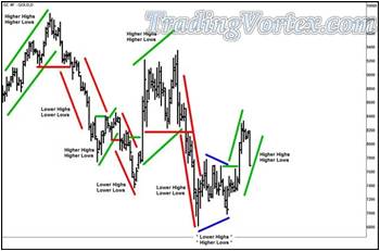
The first thing I generally do when analyzing a market is look closely at the market structure. I want to know the major swings, how they formed and where the market is at currently, in terms of swing structure.
On the daily Gold Futures chart above, I removed the red Median Line and its Parallels, and that makes it much easier for me to see and mark the major swing highs and lows.
- Note that I marked higher highs and higher lows in green, indicating price was in an up trend.
- I marked lower highs and lower lows in red, indicating price was in a down trend.
- And I marked congesting or contracting areas, where price was making higher lows and lower highs, in blue.
This simple analysis gives me a feel for the length of swings for this particular market, shows me visually how price generally confirms trend changes in this market and of course, it shows the current trend of this market.
All other analysis flows from this simple structure analysis. When I do my own pre-trade analysis on a given market, I may or may not have to draw in these swings, my eyes are well trained at this point and it is easy for me to see market structure. But if it is a market I am not familiar with or if the structure is not instantly ‘visible’ to my eyes, I clear off any lines drawn on the chart and do this simple swing analysis, and the market structure instantly becomes recognizable.
Now that I have a general feel for the market structure and the current trend, I move on to more detailed analysis:
Click on the image to open the full size version!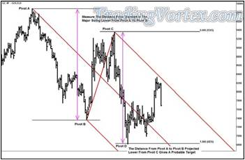
I add back in the red down sloping Median Line and its Parallels. By adding in the lines the trader originally used to ‘see’ the market, I have now connected him to his original thoughts and feelings about this market. And remember that his secondary analysis used Geometric Ratios as a way to frame his view that this market was experiencing a pullback in a down trend: because price was unable to break above the 61.8 Percent Retracement of the swing lower from Pivot C to Pivot D.
Like all traders, I have my own favorite way to use tools, and Geometric Ratios are no exception. My favorite use of these mathematical tools is a simple equal measured swing:
- I simply measure the distance price traveled when it moved down from Pivot A to Pivot B.
- Then I go to the next major swing high at Pivot C and project that same distance.
- If price moved the same distance starting at Pivot C, where would a swing down of equal length end?
- I find that equal measured swings are often deadly accurate.
Looking at the chart above, you’ll see that the distance price traveled from Pivot A to Pivot B, when projected from the next major swing high at Pivot C, would have given me a probable target for Pivot D [well before Pivot D formed] that matched where price ran out of down side directional energy and turned, forming Pivot D.
I chose this type of analysis for two reasons:
- I like using measured swings and find that they project useful targets for the length of swings;
- And because the trader had originally used a Fib Ratio to justify his pre-trade view.
I used a tool from the same family when doing my own analysis while he watched, connecting him again visually to the work I was doing.
In my general analysis of the markets, I see price unfolding in swings that have a particular frequency or length. And often, these swings can be projected quite accurately if the right tools are used. If I project a measured swing, where the distance from A to B equals the projected distance from C to D, and I see the actual swing travels the distance I projected for swing C to D and then changes direction, I know two things from experience:
- Price has probably completed the current swing in that direction and an important high or low has most likely just been made by price: because price ended its travel in one direction where it SHOULD run out of energy;
- The swings unfolding in this market will likely continue to unfold in an orderly fashion and I should be able to project them successfully, using these tools.
My first comment to the trader doing his pre-trade analysis, once I presented this chart, was that price may have completed its down side run for now, in effect, it completed its journey. I then noted that in my simple swing analysis, price was still in an up trend. It may turn lower, but on my first two charts, I see no clues that price will turn lower.
Let’s see more of the detailed analysis I presented to him:
Click on the image to open the full size version!
Price has fallen in a near vertical fashion twice on this chart. There is a tool that was modified to be particularly useful after near vertical falls, the modified Schiff Median Line. If you study the chart above, you’ll see that it is a derived version of the ‘traditional’ Median Line, formed by moving the original starting point of the Median Line ‘handle’ horizontally and vertically halfway towards the pivots that form the Median Line ‘width’. The easiest way I have found to illustrate the shift of the first pivot is the construction of a ‘box’ that begins at the ‘A’ Pivot and continues to the ‘B’ pivot on the diagonal, and by shifting the origin of the handle to the center of this box, a modified Schiff Median Line is formed.
I take the trader’s original Median Line and make it a Schiff Median Line. I chose this down sloping Schiff Median Line over a traditional Median Line because it adjusts well to the near vertical falls this market has experienced and will do a better job projecting the probable path of price. By modifying the trader’s own Median Line, I also keep him ‘in tune’ with my analysis, since I am building on his own analysis.
Now I want to consider both the down side possibilities and the up side possibilities. I add in a blue up sloping Median Line and its Parallels. As soon as I add this Median Line set, I note that price has violated the blue Lower Median Line early on, but has now moved well above the Lower Parallel. Looking closer, I see that when price violated the blue up sloping Lower Median Line Parallel, it stopped at the down sloping Lower Median Line Parallel [where price should run out of down side directional energy]. I add in a line parallel to the up sloping Median Line that goes through the low for this move at the down sloping Lower Parallel; all further down side movement should find that this new up sloping Sliding Parallel line acts as support.
The probable path of price is becoming clearer to me, but perhaps one more chart will bring it into focus for both the trader and you:
Click on the image to open the full size version!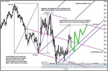
The finishing touches on this analysis are simple: I mentioned before that when I see that the measured length of the swing from Pivot A to Pivot B equals the length of the swing from Pivot C to D, I find the same tools will give me useful projections of the swings forward in time. On this chart, I measured the up side distance price traveled from swing B to Swing C and then projected that same distance upward from the low made at Swing D [If I am correct, the swing currently unfolding to the up side from Pivot D will be the same length as the swing higher from Pivot B to Pivot C]. Note that I marked where this next swing higher should run out of up side directional energy, at about $880 per ounce.
I don’t see any sign that the current up trend is over or nearing completion, so if price pulled back a bit to test the up sloping lower Sliding Parallel and that line held, I would be interested in entering a long Gold Futures position. Remember that this is the pre-trade analysis, so it is too soon to talk about specific entry prices and initial stop loss orders, but as always, I would only enter the orders if the size of the initial stop loss was acceptable and the risk reward ratio was within my normal parameters.
You can see I added a wide green line that unfolds in a wave pattern to show what I consider to be the probable path of price. Once I add the probable path of price onto the chart, it becomes obvious that if I am correct about the projected price target at $880, price will also be running into resistance at the down sloping Schiff Upper Median Line Parallel, and that Upper Parallel marks where price should run out of energy, a great place to take profits.
Let’s see what the Gold Futures did over the next several weeks:
Click on the image to open the full size version!
Price came down and tested the lower Sliding Parallel and the key support held at that level. Upon successfully testing the Sliding Parallel, price turned back higher and made a very quick run up of over $140 an ounce [nearly vertical] to the $880 per ounce area, where I projected and marked the equal measured move. And after consolidating a bit, price travelled higher and tested the down sloping Schiff Upper Median Line Parallel, where it ran out of up side directional energy.
Do not let your opinions get in the way of your trading! Do your best to do objective analysis and more important, trade the market’s actions, not your views or opinions. If you find yourself getting short three times in a row while the market continues to make new highs all morning, you are trading your opinion, not trading the market’s action. The market is always right!
How To Remain Confident Even in Uncertain Markets?
Most traders do not have the ability to identify all the major turns in a given market, but if you could, you would make a fortune right? ‘Reading the market’ correctly is only part of the story, though most traders cannot ‘read’ the market well in real time. To make money consistently, you have to be able to read the markets, employ sound money management and know when and where to take your profits. Sounds hard, doesn’t it?
Wait a moment! I forgot another key ingredient! To be a consistently successful trader, you have to keep control of your emotions and you can never run out of ‘emotional capital’ when trading, or all that hard work and preparation will end in failure. I’m not trying to be an armchair psychologist; I’m sharing what I have seen in my own 37 year trading professional career as well as what I have seen while teaching literally thousands of traders to trade or trade better.
Emotional capital is very much like the capital in your trading account: If you run low on either, you are in serious trouble as a trader. And worse, you ‘spend’ emotional capital while watching the markets, as well as when you make a winning or losing trade; like focus, traders expend emotional capital whenever they are focused on the markets. And if you are trading with too little emotional capital [or focus], you will likely make poor trading decisions.
Several weeks ago, while working with one of the traders in my one on one mentoring program, I saw a perfect example of a gifted trader that tried to trade while low on emotional capital. The trades were quite striking: you can see the quality of the trade selections decline as he continued to take trade after trade. And although the day didn’t cost him much, if he had been trading this same market, on this same day, with a pocket full of emotional capital, I believe he would have had a huge winning day.
Let’s look at his charts and see if I can describe what I saw as I watched each of his trades unfold during our mentoring sessions that day:
Click on the image to open the full size version!
This is a 352 tick bar chart of the U.S. 30 Year Bond futures. The trader had been waiting patiently for several days to catch a large move lower in the bonds, he had a feeling one was coming, but he was patient and he was waiting for the market to give him one of the high probability trade entry set ups we go over and over in mentoring.
Note that price was making lower highs and lower lows: a classic sign of a cascade lower in a trending market. And also note that price was bumping along the ‘center line’ or the Median Line.
If price mounted a nice counter trend rally, the trader wanted to sell at the Upper Median Line Parallel; if price plunged through the center line, the trader was willing to sell a re-test of this center line if price rallied from below it. But viewing the charts, he was now fairly certain he’d get his chance to get short and grab one or two points in the bond futures. He had been watching for about three hours already on the morning this image was taken. He was anxious, waiting for a trade entry he recognized to appear.
Price began a nice rally over the next few hours. When it broke and closed above several prior swing highs, he added a gray up sloping Median Line and its Upper and Lower Parallels. He noticed that price had briefly overshot the Lower Median Line Parallel, so he also added a Sliding Parallel to show where price would find likely find support should it trade back down through the Lower Median Line Parallel.
Click on the image to open the full size version!
The question is always the same when a trader sees a change in behavior in the market:
- Is this a counter-trend move that will resolve itself at an area or support or resistance, leaving the trend intact?
- OR is this a true change in trend?
In the end, only the market knows.
As an aside, the trader had now been watching this market since 6:30 in the morning and it was approaching noon, though he didn’t realize it, he had already expended a great deal of emotional capital and focus, without making a trade.
Click on the image to open the full size version!
As the market made higher highs and higher lows, the trader began to really like this emerging rally. He marked the overshoot price made below the Lower Median Line Parallel and then measuring it carefully, he projected it the same distance below the Median Line, a technique I teach in mentoring as well as in my seminars that gives a trader a high probability target where price should run out of directional energy.
He liked the up sloping lines he had drawn, so he decided to enter a long trade at the re-test of the lower Sliding Parallel. He had a nice area to place a stop loss order, right under the prior double bottoms that also served as a swing low. There should be limit buy orders at the double bottoms and these orders should act as a buffer to protect his stop loss sell order should price begin to trade below the Sliding Parallel.
And he had a very nice price target to lock in his profits: He’d leave a limit sell order at the inside Sliding Parallel, which was below the Median Line the same distance that the lower Sliding Parallel was below the Lower Median Line Parallel.
Though he had been anxiously awaiting an opportunity to get short this market for about six hours, he finally saw an opportunity to take a trade using a trade entry setup he recognized; all thoughts he had previously about the bonds trading lower went out the window when he added those up sloping lines. He had been waiting for a trade for over six hours and he was going to get one!
Click on the image to open the full size version!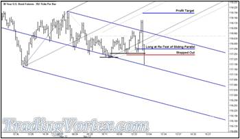
Just after he got long, news hit the market and bond prices rallied in a fast market. But they failed well before they made it to his up side target. Because he had been watching this market for over six hours, waiting for a trade, his focus wasn’t particularly sharp. The bonds came down as fast as they went up and he hadn’t moved his initial stop loss order to break even and he was quickly stopped out of the trade.
Now that price had violated his up sloping lines, the thoughts he had before the trade came flooding back into his mind: He had been waiting for several days for a chance to get short this market! This was an exhaustion rally! Rather than looking for a place to enter sell orders, he had got caught long along with everyone else, and then stopped out along with everyone else. He was angry with himself.
He had made two key mistakes, though he wouldn’t realize them until the trading day was over:
- 1) He’d been waiting several days for an opportunity to get short the bond futures and after waiting for six hours for a set up, he found one when he was low on focus: he got long and got stopped out;
- 2) He was now spending more emotional capital being angry with himself over the failed trade.
I teach the traders I mentor that at this point, they need to walk away from the screen and take at least a fifteen minute break. Their eyes are glazed over from watching the markets for too long, they are low on focus and probably low on emotional capital. If they continue to trade in this state, the quality of the decisions they make will deteriorate and they are at real risk of doing serious damage to their trading account capital [in plain English, they could lose a lot real fast!].
But this trader wasn’t thinking about taking a break:
Click on the image to open the full size version!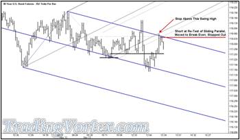
He took a look at the charts and to his credit, saw a high probability entry at an Energy Point.
He got short at the re-test of an Energy Point, against a down sloping Upper Median Line Parallel. And his initial stop order was hidden above a swing high, where traders looking to get short had likely left a good deal of limit sell orders. And though it’s not marked on his chart, his profit target was down at the Lower Median Line Parallel: a logical profit target that should net him about 1 ½ points in the bond futures.
Where did it all go wrong?
His orders were set up perfectly. Everything was thought out logically and he entered the orders into the market via his trading platform perfectly. Price rallied to fill his limit sell order and then started to sell off.
But remember, he was running low of emotional energy. Price sold off enough to show him 3 or 4 ticks in potential profits and for a few moments, he was sure the sell off he had been looking for had finally materialized. He was ecstatic!
That was his third mistake of the day. He was spending additional emotional capital on a trade that was just beginning to unfold. And he didn’t have the emotional capital to spend!
When price pulled back to his entry price, he was emotionally bankrupt. Now he was certain price was heading up to stop him out. He put in a limit buy order to exit his short position and was quickly filled. Then he canceled all his orders. He’d managed to get out without losing any trading capital. But he’d spent a great deal of emotional capital and focus.
And worse, the bonds closed on their lows and then kept heading lower. And he was flat.
Click on the image to open the full size version!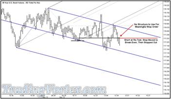
I teach the traders I mentor that at this point, they MUST take a break and clear their head. If they are really smart, they’ll quit for the day. He didn’t quit for the day. As bonds continued to sell off, he added in a horizontal line that showed what we call the ‘balance’ of the action. It’s a line with multiple highs and lows touching it, very much like a horizontal Center Line. When price breaks below this line, it is likely to be headed considerably lower.
Note on the chart above that he correctly identifies this key line. And he also feels that once price breaks below it and closes below it, he should be selling any re-test of the line from below. He sees it and then he places his orders into the market.
But there is one key ingredient missing: There is no price structure for him to hide his order behind. Instead, he decides to enter without a ‘safe’ stop loss order and puts in a five tick cash stop loss order.
Once his limit sell order is filled, anxiety returns. He is short this market again, at a worse price, and this time, he doesn’t have the protection of hiding behind the limit sell orders at a swing high or market structure. Price sells off three ticks and he starts to feel the anxiety disappear.
But then price comes right back to his entry price. He knows he is using a cash stop loss order. He really doesn’t want to take a five tick loss. Before he thinks much about it, he has entered an order to buy his short position back at break even. And in the blink of an eye, he’s flat.
And then the market turns back down, making new lows for the move.
Price quickly breaks below the down sloping Median Line, a strong sign of weakness:
Click on the image to open the full size version!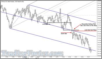
He hasn’t had enough punishment yet. He’s seen all the moves and all he has to show for his keen vision is a small loss on the first long bond trade.
He sees a potential high probability trade unfolding right in front of his eyes. It’s an entry I teach called ‘Zoom and Re-Test’. When price accelerates through the Median Line [the Zoom], it should come back to test the Median Line within three to five bars [the Re-test]. IF you can also identify a quality stop loss area, you sell the re-test and place your stop loss order and hang on for the ride.
He saw price zoom the Median Line. He watched as price re-tested the Median Line from below. Then he entered an order to get short IF price re-tested the Median Line. He was so tired and so emotionally drained, he identified the wrong bar to sell. He should have gotten short at the first bar that tested the Median Line after the Zoom; there is no need to wait for a second test unless it has been more than five bars between the Zoom and Re-test.
And of course, there was no market structure for him to hide his stops beyond. But he put a sell order into the market.
For better or worse, the market did not rally high enough to fill his poorly placed sell order. Prices sold off further from this point, eventually reaching the area where he should have been taking his profits from the first short bond trade [he would easily have gotten more than $1500 per contract]. Of course, he missed the entire move down. And he finally shut his screens off and went out to clear his head.
Where did he go wrong?
His first inclination was to identify an area in this market to initiate a short position. I find that a trader’s first plan is generally the best. Early in the trading day, you have the most focus and you haven’t spent any emotions on the markets. You are at your best at that point.
Rather than sticking with his original plan, he spent some emotional capital and focus chasing a long trade in the bonds. And he never got back in step with the market after that initial trade. He correctly identified each high probability shorting area, yet walked away with nothing to show for it other than a small loss from the long trade. He was quite lucky he didn’t lose a great deal of real money. Although he ‘saw’ the turning points in the market crystal clear, he was stumbling along blindly, getting out of his positions because of fear. This is a sign he was emotional bankrupt.
Don’t trade when you are not 100 percent recharged. When you trade with real money in the markets, you need to remember you are trading against the smartest and best traders in the world. If you have been staring at a screen for two or three hours, get up and take a nice fifteen minute break! Clear your head, find your focus and get your edge back. Then come back and look for a high probability trade entry.
Taking Quick Profits vs Letting it Run: “Bread and Butter” or “Bread Crumbs”?
I am fortunate enough to mentor a diverse group of traders, some of them professionals, some of them just starting out. It’s a fascinating experience as a teacher to teach each of these traders one on one, because the goal is not to make them clones of me, but to develop them into successful traders with their own style of trading. Each of them has different strengths and weaknesses and different ways to look at the market; they all progress at their own rate. Some of them manage other people’s money [I currently mentor two different CTAs, a Hedge Fund Manager and the Manager of the Midwest branch of a stock brokerage firm, along with a handful of individual traders] and some of them are just starting out, so they are trading very small accounts. Some of them make 5-10 trades in a day and some of them make 2 or 3 trades a week.
I recently wrote a multi-part article called ‘Getting Paid to Trade by the Market’ that highlighted a profit taking technique four of my students use, although each has their own variation on it. We call it ‘Bread and Butter’, because it’s much like ‘Making Donuts’ or ‘Slicing Sausage’. The first is a phrase I use to call my intraday ‘cookie cutter’ trades because they are basically doing the same thing over and over [repetitious, not exciting and profitable equals ‘Making the Donuts’.]. The second is a phrase a friend of mine uses when he speaks of how he approaches the markets. He says he ‘slices sausage’ each day and at the end of the month, all the slices add up to a mountain of sausage.
The four students use variations on the same theme, which I highlighted in the ‘Getting Paid to Trade by the Market’ article. For example, in the currency futures, one student uses a maximum stop loss of 10 ticks. As soon as price has gone 7 ticks in his favor, he moves his initial stop loss to break even. If price goes 14 ticks in his favor, he takes off 1/3 of his position and moves his break even stop up to a 7 tick stop profit order. If price goes on to reach 21 ticks in his favor, he takes another 1/3 of his position off and moves his 7 tick stop profit up to a 14 tick stop profit. Then he tries to manage the last 1/3 using market structure, meaning if he is long, he will hide his stop profit orders at higher and higher levels as price leaves higher swing lows, because there will be Limit Buy Entry orders at each of the Swing Lows left by traders that missed getting long or traders looking to add to their position. His goal is to get to break even fast and get to his first two profit targets the majority of the time and catch a much larger move on the final 1/3 of his position about 20 percent of the time.
Another student takes ½ his position off just below the first overhead market structure if he is long, then moves his initial stop loss order up to break even. Then he treats the remaining ½ as a ‘runner’, trying to maximize the profit on the remaining half by hiding his stop profit orders below market structure as it unfolds.
Another takes 1/3 of his position off at 10 ticks and then moves to break even, takes 1/3 off at 20 ticks and leaves his stop profit at break even. He takes the final 1/3 of his position off at 40 ticks, a level he has seen as a statistical ‘node’ or regularly reachable profit target in the currency futures he generally trades.
The final trader of the four bases his targets on the percentage of the average range of the past 20 trading days: He takes his first profit at 10 percent of the recent range and moves his initial stop loss order to a break even stop. Then his second profit order is at 25 percent of the recent range and his final target is at 60 percent of the recent range; once he has moved his stop loss order up to break even, he leaves it there, trying to let the trade mature.
Let me show you a chart from the article ‘Getting Paid to Trade by the Market’, because a chart often makes things much clearer:
Click on the image to open the full size version!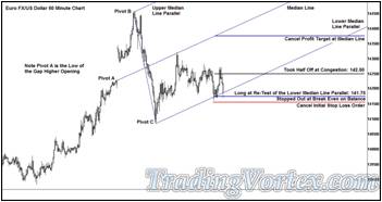
You can see that this particular chart shows that one of the traders I mentor takes half his position off just before the first overhead market structure when he is long and then moves his initial stop loss order to break even. On the chart above, you can see that he moved to break even after price reached his first profit target, getting him out of half of his position for a nice 75 tick profit, but it then came back down and stopped him out at break even on the second ½ of his long position.
Do these four traders net make money?
They do indeed. One of them is a very active CTA, one is an experienced trader that likes to book profits to reinforce the methodology he is using when he trades and the other two are fairly new traders with smaller accounts. These two traders like ‘Bread and Butter’ trading as a style because they are trying to build the size of their accounts as they master this methodology, so moving to break even quickly and taking frequent smaller profits is more comfortable to them.
Now you should know that I did not teach any of these students this exit method, they each developed their own exit strategy on their own; four of them developed a similar twist without my input that I eventually named ‘Bread and Butter’. But I mentor other traders as well and one of them read the ‘Bread and Butter’ article and at his next mentoring session, told me that in his opinion, I wasn’t really helping these traders by encouraging them to take frequent quick profits. We discussed the reasons each of these traders had for choosing the ‘Bread and Butter’ method of relatively quick exits and though this trader acknowledged that each trader should embrace a style they are comfortable with, he wanted to continue the discussion: He wanted to know if I had made a trade that day and if so, what did MY trade look like? In his mind, after studying my articles and the posts I made on own web pages and free forums over the past six or seven years and having been in my mentoring program for more than five months, he felt my trade would look vastly different than the ‘Bread and Butter’ trades. In fact, he said that if I had a position on, in his opinion, it would show that the ‘Bread and Butter’ traders were really only taking the ‘Breadcrumbs’. I chuckled at his analogy and then admitted I had indeed taken a trade that day, after the ‘Bread and Butter’ traders had been stopped out at break even on the remaining portion of their trades.
Let’s take a look through my eyes at what was happening in the market at that point:
What caused the market to move the way it moved, and how I entered and managed my trade.
Now, it’s important to note that the ‘Bread and Butter’ chart used by the trader in the original article was a 60 minute chart of the Euro FX/US Dollar cash FX pair. I generally trade on 240 minute charts, so some of the price action appearing on the first chart [a 60 minute chart] disappears on a 240 minute chart, because each 240 minute bar contains the price action of four 60 minute bars.
Click on the image to open the full size version!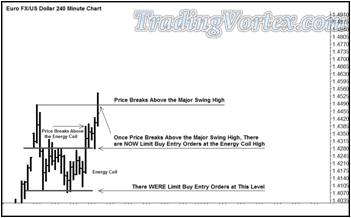
Price gapped open higher on Sunday night, leaving what became a Major Swing High before trading lower. Price then formed an Energy Coil: an area of congestion where price re-stores its Energy; the low of the Energy Coil was just above 1.4070 U.S. Dollars per Euro and the high of the Energy Coil was at roughly 1.4280. Price was unable to close above or below the Energy Coil for 14 bars, but it finally showed a change in behavior by breaking and closing above the Energy Coil. It then consolidated its gains, leaving a pair of bars that had lows that tested the highs of the Energy Coil. But after four closes above the Energy Coil, price shot higher and broke above the Major Swing High made early Sunday night.
There had originally been Limit Buy Entry Orders at the low of the Energy Coil, left by traders that were willing to get long at the multiple bottoms just above 1.4070. But once price broke above the Major Swing High was taken out, the majority of the Limit Buy Entry Orders moved higher, to the multiple tops of the Energy Coil near 1.4280 that had been resistance but was now most likely support. These Limit Buy Entry orders were left by traders that had failed to get long when price was bottoming at 1.4100 and now were watching new highs being made above 1.4500 and they were not long, the train had left the station without them, as they say.
Click on the image to open the full size version!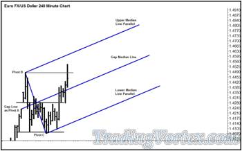
When price broke above the Major Swing High at 1.4483, I add a blue up sloping Median Line. Note that like the ‘Bread and Butter’ traders, I used the low of the Sunday night gap as Pivot A when drawing my Median Line set [This particular type of Median Line is called a Gap Median Line because one of the extremes of an open gap is used as a pivot].
At this point, I had a pretty good feeling for where the Limit Buy Entry Orders were sitting and though price had taken out the major Swing High, I was not ready to enter a trade, I did not see any sign of what I consider to be a high probability trade entry set up. Nor did I see any trade set up that had an initial stop loss that was within my own acceptable range. I was mildly bullish but I saw nothing interesting enough to get me to enter the market at this point.
Click on the image to open the full size version!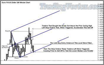
Then an interesting thing happened: one of those market moves that occur when you least expect them. When price broke above the prior Swing High at 1.4483, a good deal of traders went long on the break out to new highs. Though price made it up to 1.4542, note that the break out bar closed well below the prior Swing High and in the lower half of the break out bar. That meant that all those traders that went long on the move to new highs had losses in their positions at the close of the same 240 minute bar they had entered on. And looking at the next five bars, you can see that the news did not get better for these traders. There WERE Limit Buy Entry Orders at the high of the prior Energy Coil, at about 1.4280, but by that point, the break out buyers were liquidating their long positions and price ran right through these resting buy orders.
And the traders that had patiently left Limit Buy Entry Orders at the 1.4280 area quickly found that once their buy orders were filled, they, too, were holding losing positions and so the sell off continued as the second set of stop loss orders began to be triggered.
The outcome of this break to a new high followed by a sell off through multiple areas of support left price testing the up sloping Lower Median Line Parallel; in fact, the test bar pushed through the Lower Median Line Bar. To this point, few traders likely got out of their long positions with a profit unless they were using ‘Bread and Butter’ style orders to take profits on the way up and moving their stop loss orders to break even.
As this last bar closed, here is what I saw:
Click on the image to open the full size version!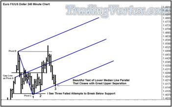
As the last bar closed, I took a very close and careful look at this formation and at its interaction with the up sloping blue Median Line set. I immediately saw that the last bar had tried to break and close below the blue up sloping Lower Median Line Parallel. But price closed well above the Lower Median Line Parallel, with great up side separation. This is a sign of strength, a sign that there are buyers below the market.
As I looked to the left of this formation, I noted that price had already tested this blue up sloping line and failed to break and close below it. Finally, looking just a little further to the left, I noted that the low I used as my Pivot C tested the multiple lows just above 1.4070 but was unable to break below them, and in fact closed with great up side separation above these multiple lows. Now I looked at the entire formation and saw three failed attempts to break below areas of support. And note that each failed attempt to break support was at a higher and higher level. This formation is not talked about much these days, with the advent of all the pretty computer generated indicators, but when I was first learning to trade, it was called ‘Three Drives to the Bottom’. And generally if the three drives to the bottom had higher and higher lows, price tended to move higher after the third drive lower.
Take a look at what I now had in mind:
Click on the image to open the full size version!
I was unwilling to get long when price broke out to new highs, there was no high probability trade set up that I recognized and there was no acceptable stop loss. But this formation was quite familiar to me and I had this in mind:
- 1) I wanted to buy a re-test of the blue up sloping Lower Median Line at 1.4160.
- 2) My initial stop loss would be 5 pips below the prior swing low that had tested the Lower Median Line Parallel, at 1.4092.
- 3) My profit target was a test of the Upper Median Line Parallel at 1.4636.
What made me think price would make it past the Median Line if it turned higher from here and make it up to the Upper Median Line Parallel?
If the market re-tested the Lower Median Line and allowed me to get long, there were two possibilities:
- 1) I’d either get stopped out very quickly because I would be wrong about the three higher lows and the great up side separation at each test being a sign that there were good buyers below the market; or
- 2) The market would go significantly higher, because the long positions had all been liquidated at this point.
Only the market knows where it is going, and the market is always right.
Let’s see what the market did next:
Click on the image to open the full size version!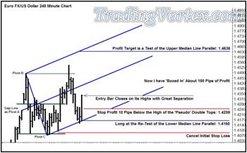
Price did indeed come down and re-test the blue up sloping Lower Median Line, getting me long at 1.4160 in the process. And look where the re-test bar closed: On it’s highs, with great up side separation, another sign of strength [so far, so good!].
As my entry bar closed, I noted it was a wide range bar that closed on its highs, and at this point, from where I entered my long position to the close of the entry bar at 1.4341, I had a potential profit of 181 pips! I certainly couldn’t let this much profit turn into a loss. I could move my initial stop loss order to break even but I didn’t want to leave 181 potential points of profit on the table unprotected either. When I am long, I generally place my stop profit orders underneath market structure, because there are generally Limit Buy Entry Orders sitting at these structures that will act as some protection for my stop profit orders. But there was no conventional market structure for me to hide my stop profits below this time: the recent sharp sell off had destroyed all semblances of structure, other than the bottoming formation that was still intact.
After a bit of thinking, I decided to put a stop profit order 10 pips below the tops of the pair of bars with nearly the same highs the current bar had just run above. I canceled my initial stop loss order at 1.4092 and entered a stop profit at 1.4259, locking in roughly 100 pips should price turn on a dime and sell right back off.
Click on the image to open the full size version!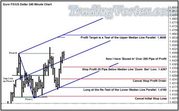
The next three bars were also higher and each had a higher close. There was still no obvious market structure for me to hide any stop profit orders beneath, but with price closing at 1.4472, I now had a healthy potential 312 pips of profit in the position. I had no choice but to be creative: I placed my stop profit order 25 pips below the low of the bar that had zoomed above the Median Line, at 1.4367.
In reality, these are nothing more than ‘cash profit stops’ because they are not using any widely used market structure as protection. I never use cash stop loss orders, but I now had so much profit in this position that I had to keep ‘boxing in’ profits, using what amounted to a cash profit stop, to me, using cash profit stop orders is quite different from using cash stop loss orders, though I seldom ever use cash stop profit orders. It’s very unusual for me to find myself with a position and no structure to hide my stop orders above or below, but the market is always right! I was here with a great deal of profit in my open position and I had to protect it. Note that I ran my cursor along the Upper Median Line Parallel and found that because of the upward slope of the line, my profit order should now move higher, to 1.4648. I am trading with the trend, because I am long against up sloping lines, so I get paid more the longer I hold this position as long as I move my orders higher.
Three more bars unfold and again, all three closes have higher highs and close higher. There is still no discernable market structure, this is what I refer to as a ‘chimney formation’, though it’s not yet clear if it is just the opposite side of the downward chimney formation from the prior highs. I am on the right side of the market and at the close of the last bar on this chart at 1.4600, I have a potential profit of 440 pips.
I cancel my prior stop profit order and move it higher, to 50 pips below the low of the just-closed bar at 1.4492. If price turns around at this point, I will be stopped out for a very nice profit of 332 pips. Once I move up my stop profit order, I check where price would intersect with the Upper Median Line Parallel when the next bar forms: that price is 1.4679 and so I move my Limit Sell Order, my profit target, accordingly.
This part of trading is the hard part, doing the little things without making mistakes. But it’s the attention to detail and the logical movement of stop orders and profit orders that can maximize your profitability. It is fun to look at the newest multi-color computer generated lagging indicator in the magazines, but it is truly the work once you get in a trade, managing the trade correctly, that can make all the difference in the world, but it isn’t fun to look at and most traders don’t really want to talk about it or read about it.
New indicators are fun toys! Money management is…well, boring. But a good understanding of money management really drives your profits, in my opinion.
Click on the image to open the full size version!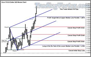
The next bar ran higher, taking me out of my long Euro FX position at 1.4679, for a total net profit of 519 pips. Price did go higher, but that didn’t bother me in the least. I had a plan, I traded my plan, and now I was flat with a nice profit. The market would go where it wanted to go, but my planned ride was over. And it ended quite nice, thank you.
As a mentor, how do I compare my style of trading this market with the style used by some of traders, namely those using ‘Bread and Butter’ style trading to approach these markets? Certainly I made much more on my trade than any of them did. But my capital was exposed for a great deal longer than their capital was exposed. And I was willing and able to be very patient when looking for an entry: If I go three or four days without a trade, it doesn’t bother me in the least. My focus is on producing a smooth capital appreciation in my account, not building my account from $10,000 to $15,000 in XX months. Nor do I have clients looking over my shoulder asking me to trade frequently. I have the luxury of only ‘swinging the bat at the pitches I recognize’, as Ted Williams used to say. If I don’t see a trade set up I like, I’ll wait patiently; one will eventually come along in one of the markets I watch.
And if you look closely at my stop profit movements, there was a little ‘Bread and Butter’ order placement going on as well. In the end, I feel that each trader must master their tools, master themselves and find a trading style that suits their strengths and weaknesses. In mentoring, I do my best to help each of my students become the best trader they can be by developing a style that suits their own strengths and weaknesses. Only then can they become the best trader they can be.
How to Boost Your Trading Skills and Profits with 14 Proven Strategies from a Successful Trader:
In this article, you have learned 14 trading strategies from a successful trader who has made millions of dollars in the stock market. These strategies cover various aspects of trading such as planning, risk management, technical analysis, trend following, diversification, and more. By applying these strategies, you will be able to improve your trading skills and profits, regardless of the market condition. You will also avoid the common trading mistakes and pitfalls that most traders fall into. You will gain confidence and consistency as a trader, and ultimately achieve your trading dreams.
These strategies are not just random tips or tricks that may work sometimes. These are proven strategies that have been tested and refined over 20 years of trading experience. These strategies will teach you how to:
- Plan your trades and execute them with discipline
- Control your risk and protect your capital
- Use technical analysis and indicators to spot profitable trades
- Trade with the trend and avoid losing trades
- Diversify your portfolio and trade different markets and time frames
And much more!
As Warren Buffett, one of the most successful investors of all time, once said, "The most important quality for an investor is temperament, not intellect." Trading is not only about knowledge and skills, but also about attitude and mindset. You need to have the patience, discipline, and courage to follow your trading plan and stick to your strategies. You need to have the humility, curiosity, and willingness to learn from your mistakes and improve your performance. You need to have the passion, enthusiasm, and motivation to pursue your trading goals and dreams.
If you want to learn more about trading and get access to more resources and tools, please visit our website and subscribe to our newsletter. You will get the latest updates, tips, and insights from our team of experts and successful traders. You will also get access to our exclusive trading community, where you can interact with other traders, share your ideas, and get feedback and support.
Thank you for reading this article and we hope you enjoyed it and learned something new and useful. If you have any questions, comments, or suggestions, please feel free to contact us anytime. We would love to hear from you and help you with your trading journey.
What are you waiting for? Start implementing these 14 trading strategies from a successful trader today and see the difference in your trading results! Happy trading!


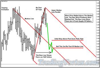


 TradingVortex.com® 2019 © All Rights Reserved.